Choosing the perfect colour for your interior isn’t just about aesthetics, it’s also about how the space makes you feel. But which colour should you choose? And how will it influence the mood and atmosphere of your space?
Let’s explore the world of colour psychology and how it can help you choose the right shade for your walls.
Colours affect our emotions, energy levels, and even how spacious or cozy a room feels. When paired with the unique texture of lime paint, these psychological effects become more pronounced. That’s why understanding the emotional and psychological undertones of colours can help you design a space that truly reflects your intentions.
Here’s how to apply colour psychology to different lime paint shades depending on your room’s purpose:
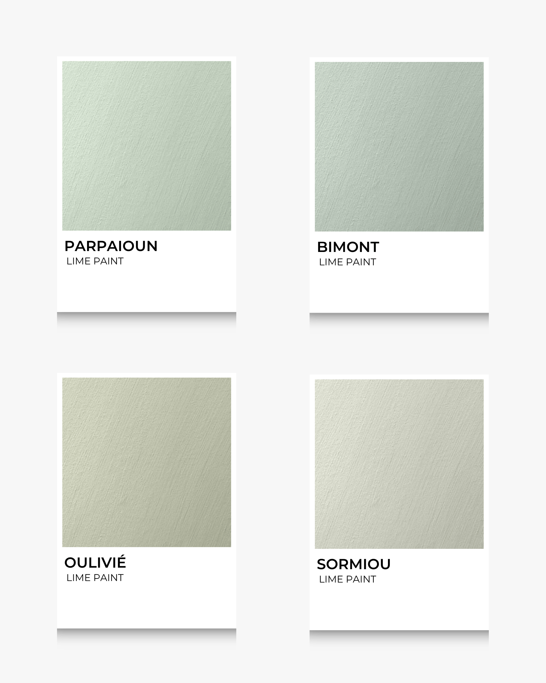
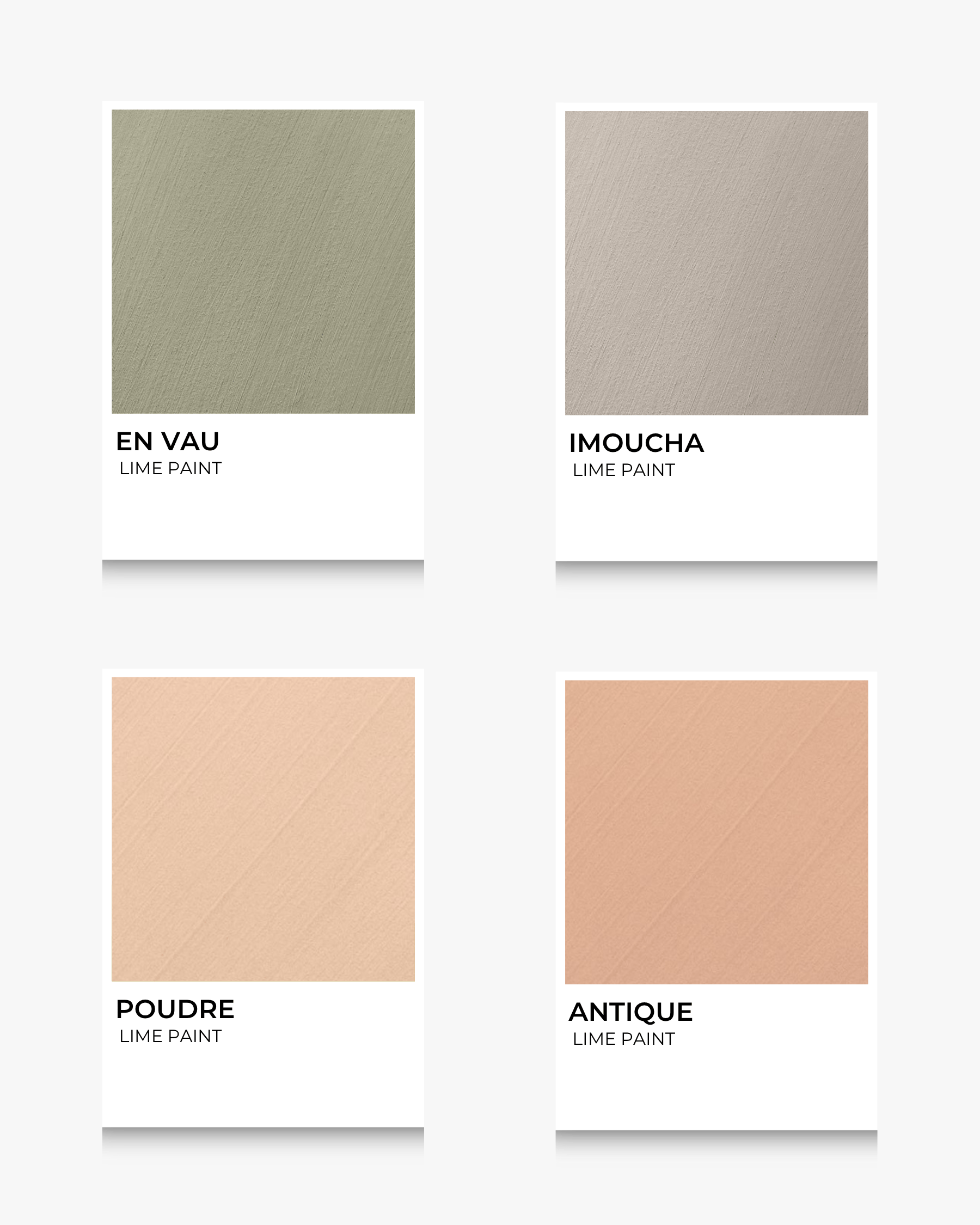
Green is associated with balance, renewal, and calm. Sage and muted olive lime paints are ideal for bedrooms, studies, or any space where rest and restoration are key. The natural chalky look of lime paint enhances this sense of tranquility.
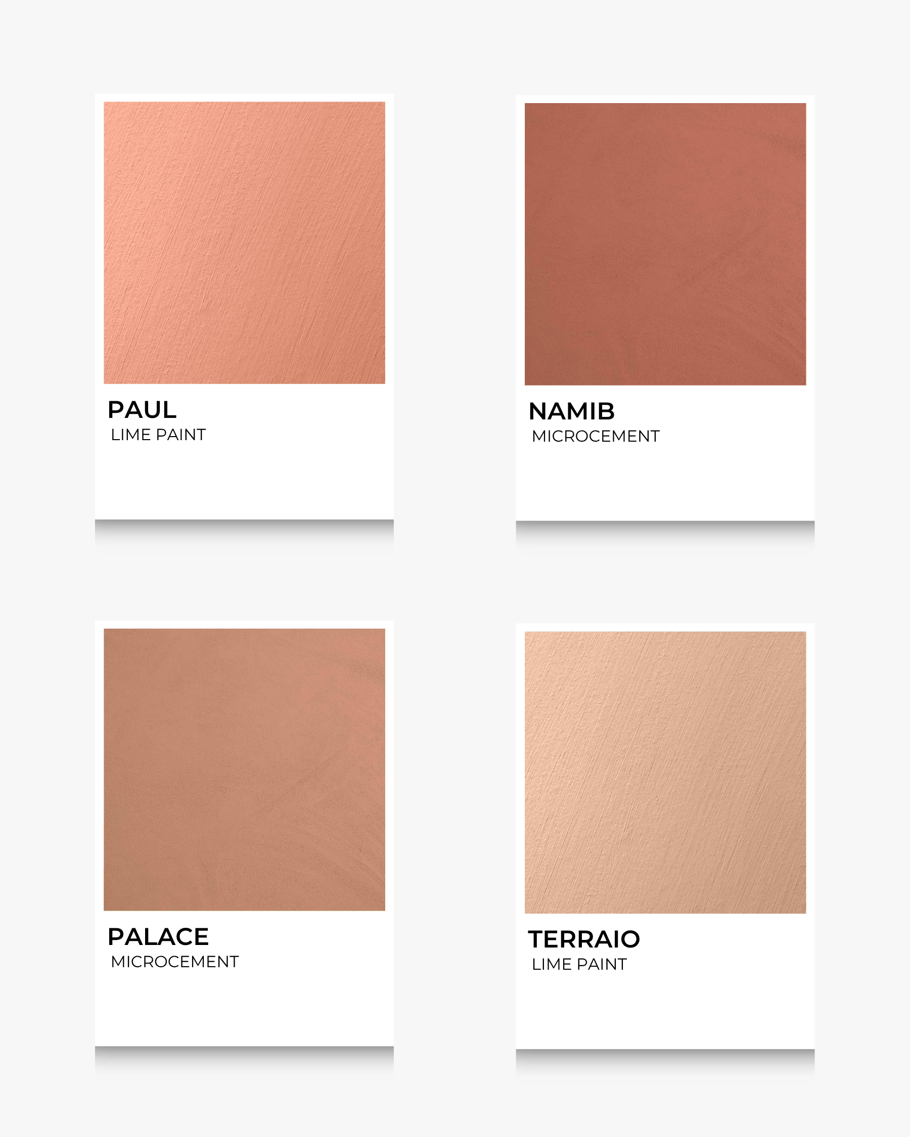
Rich terracotta and golden ochre tones evoke warmth and comfort, making them perfect for living rooms or kitchens. These hues can spark conversation, nurture creativity, and make a space feel grounded and homey.
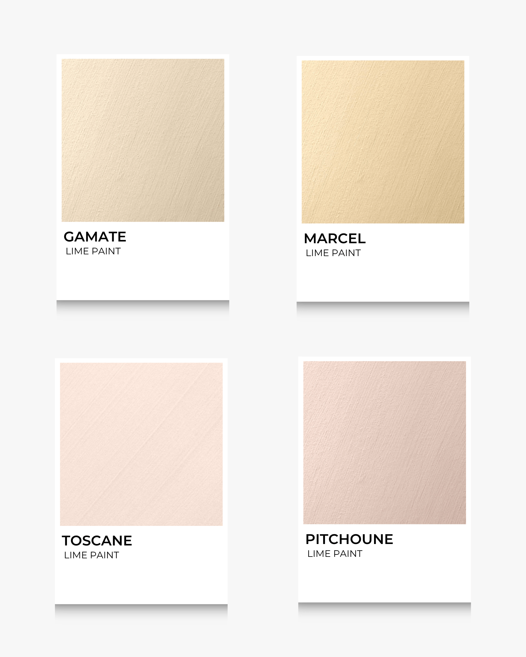
If you want to add a touch of cheerfulness to a bathroom, hallway, or small nook, soft yellow or peach tones can help. These colours bring light and positivity, especially when illuminated by natural daylight on a lime-painted surface.
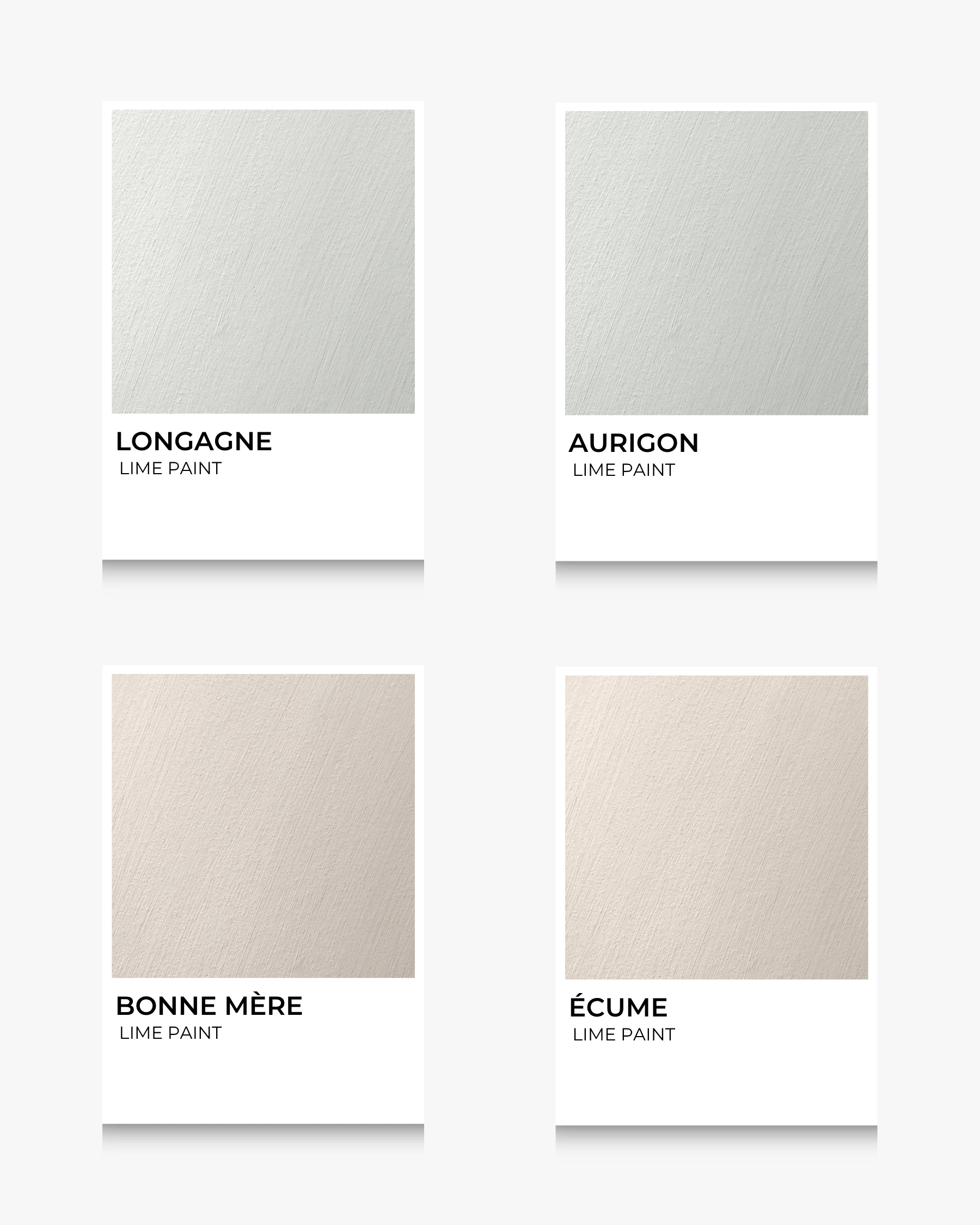
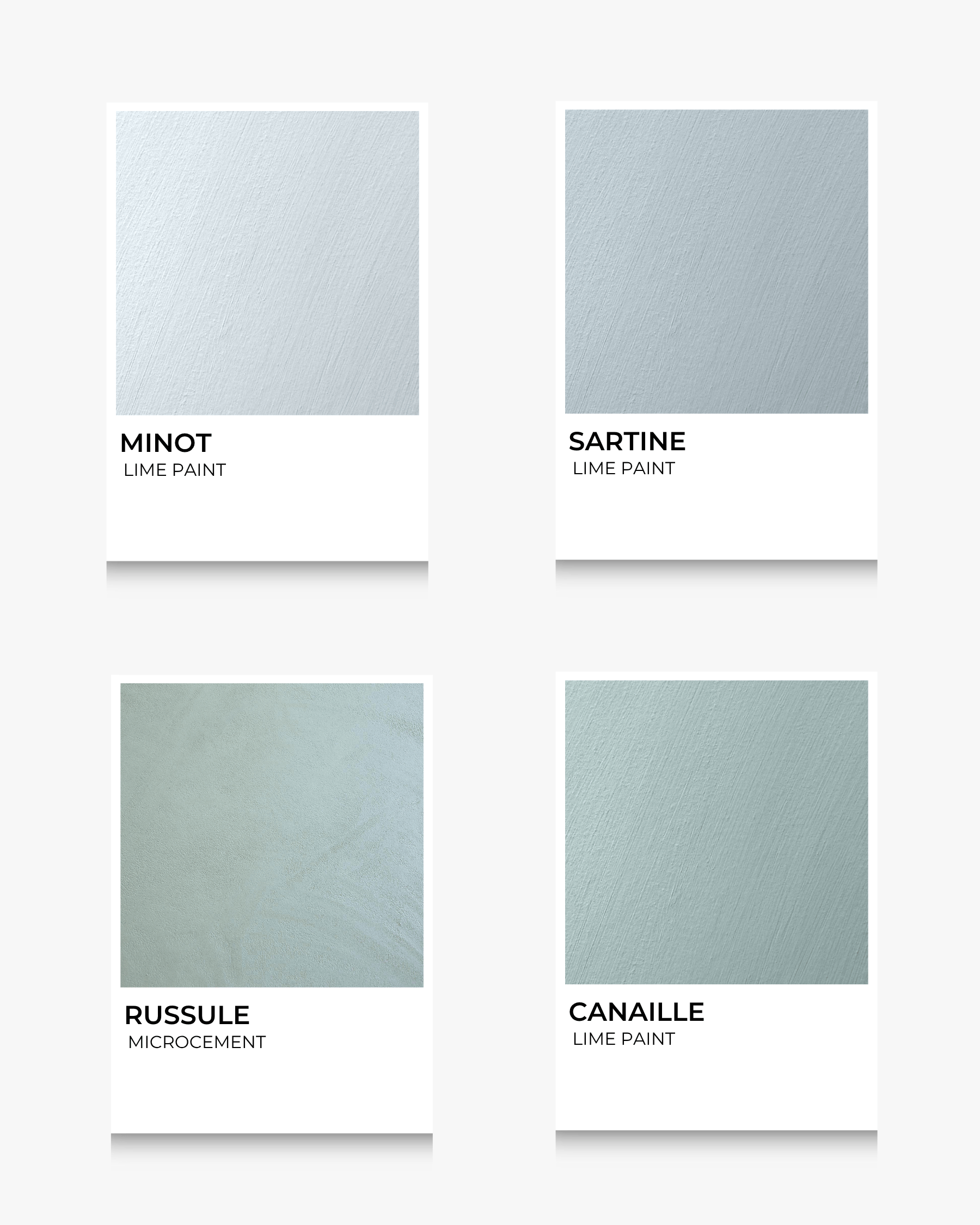
For a more modern, minimalist approach, cool greys or greige (a blend of grey and beige) offer a sense of calm and elegance. These colours work especially well in communal spaces or work areas where focus is essential.
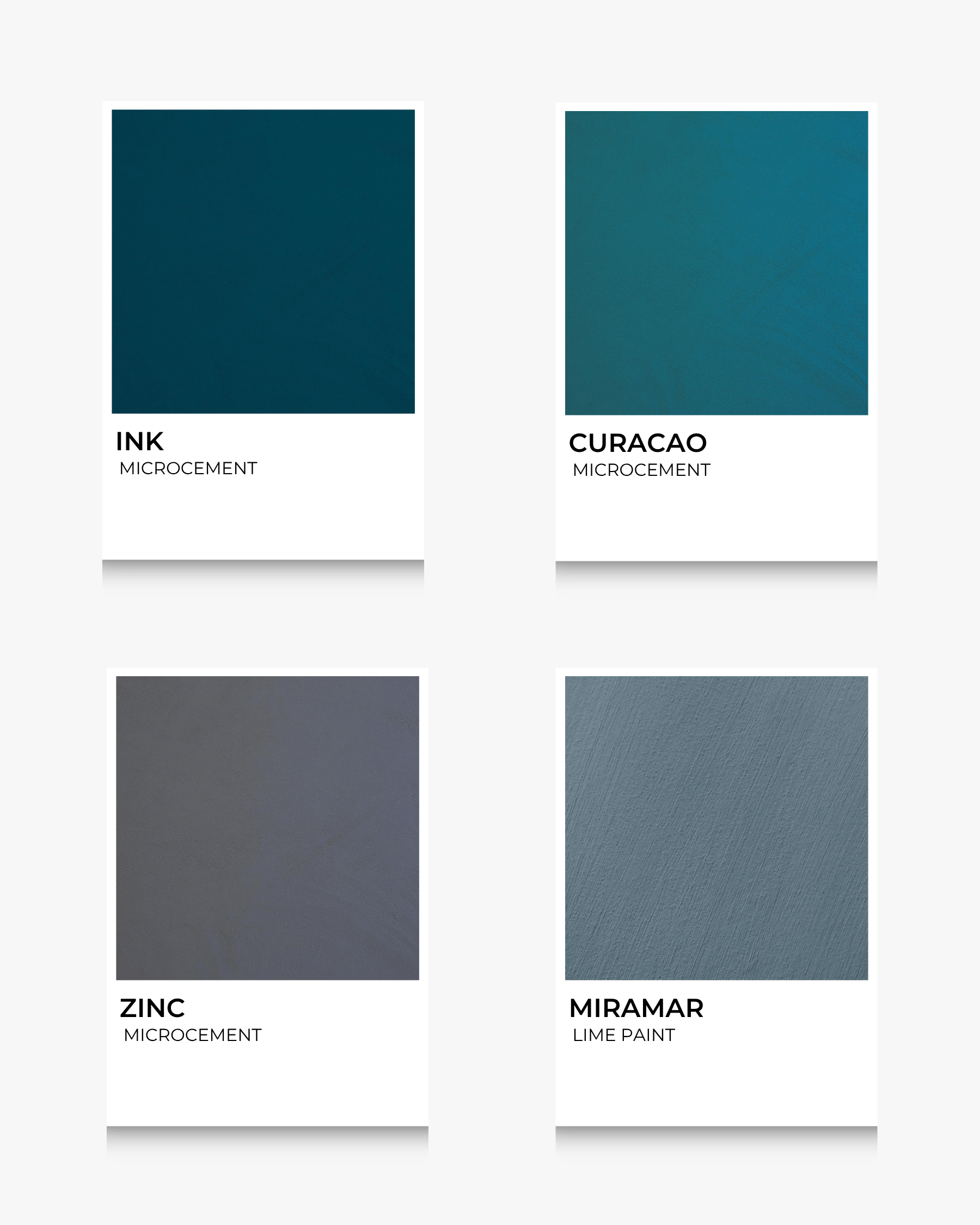
Dark, moody shades like navy or charcoal create intimacy and reflection. They are well-suited for dramatic dining rooms, cozy reading corners, or creative studios. Lime paint’s natural variation brings these deep colours to life with texture and depth.
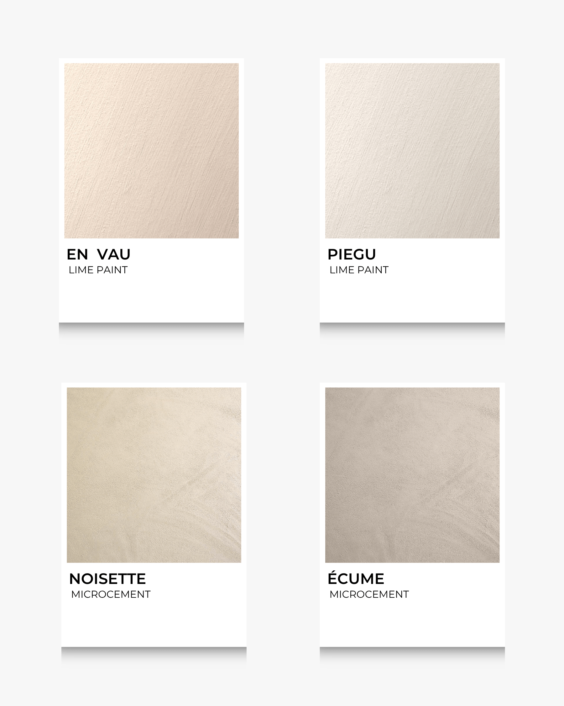
For spaces that need a versatile and grounding backdrop, lime paint in stone, sand, or mushroom tones brings timeless elegance. These shades are especially effective in open-plan areas where warmth and neutrality are equally important.
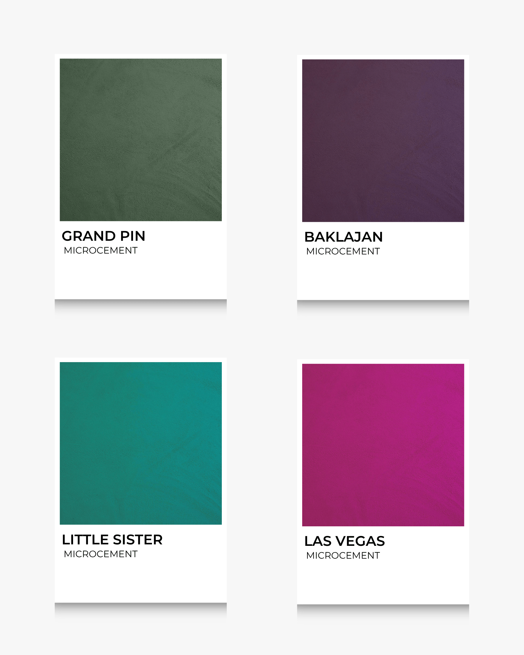
For those looking to make a bold, characterful statement, rich shades like deep burgundy, moody plum, or emerald green offer personality and power. Lime paint softens their intensity with texture, giving the space a dramatic yet sophisticated edge.
Blue-green tones evoke the freshness of sky and sea—perfect for bathrooms, creative spaces, or anywhere you want a breath of fresh air. Dusty blues and teals feel both calming and energizing, and lime paint adds a dreamlike softness to their cool charm.
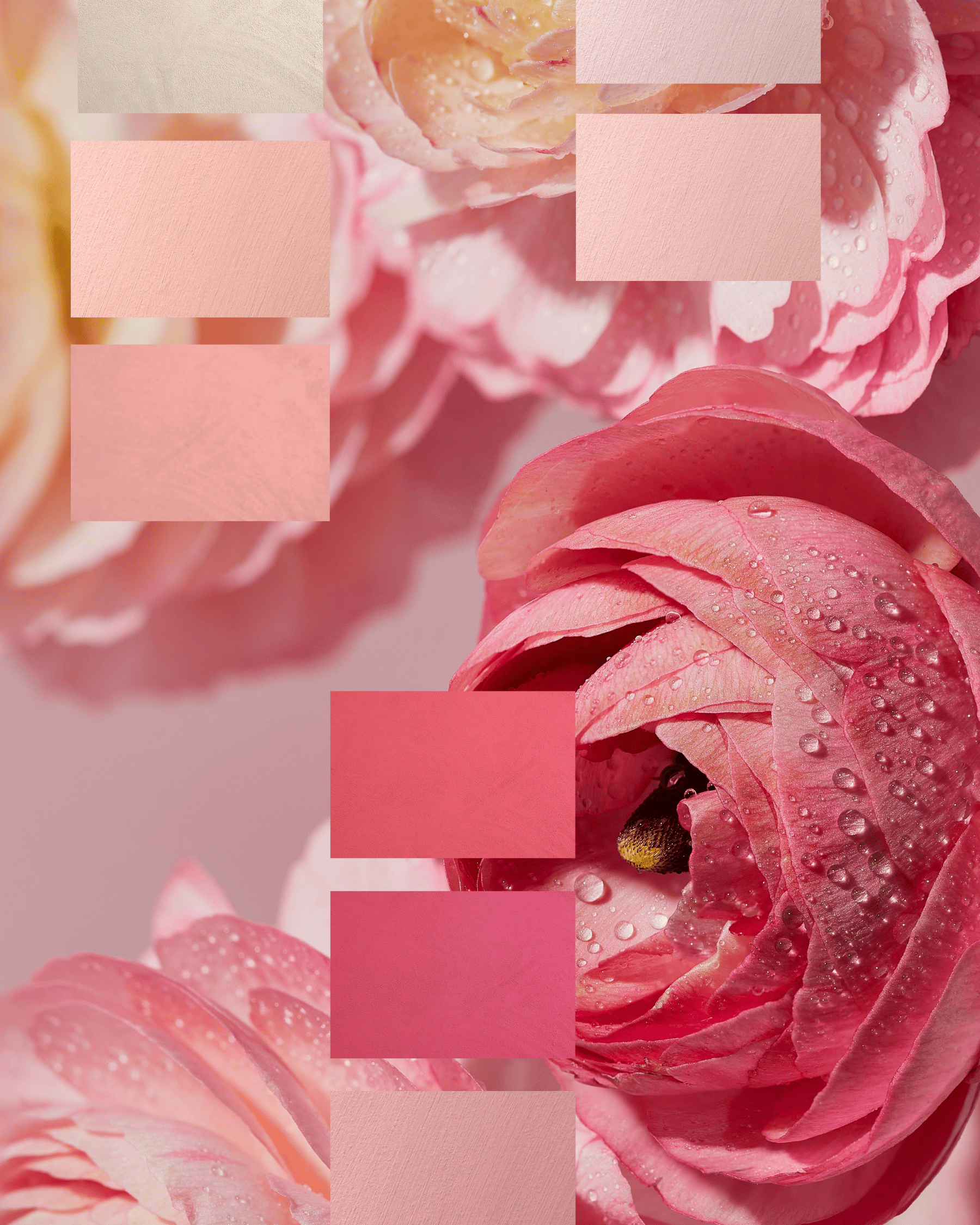
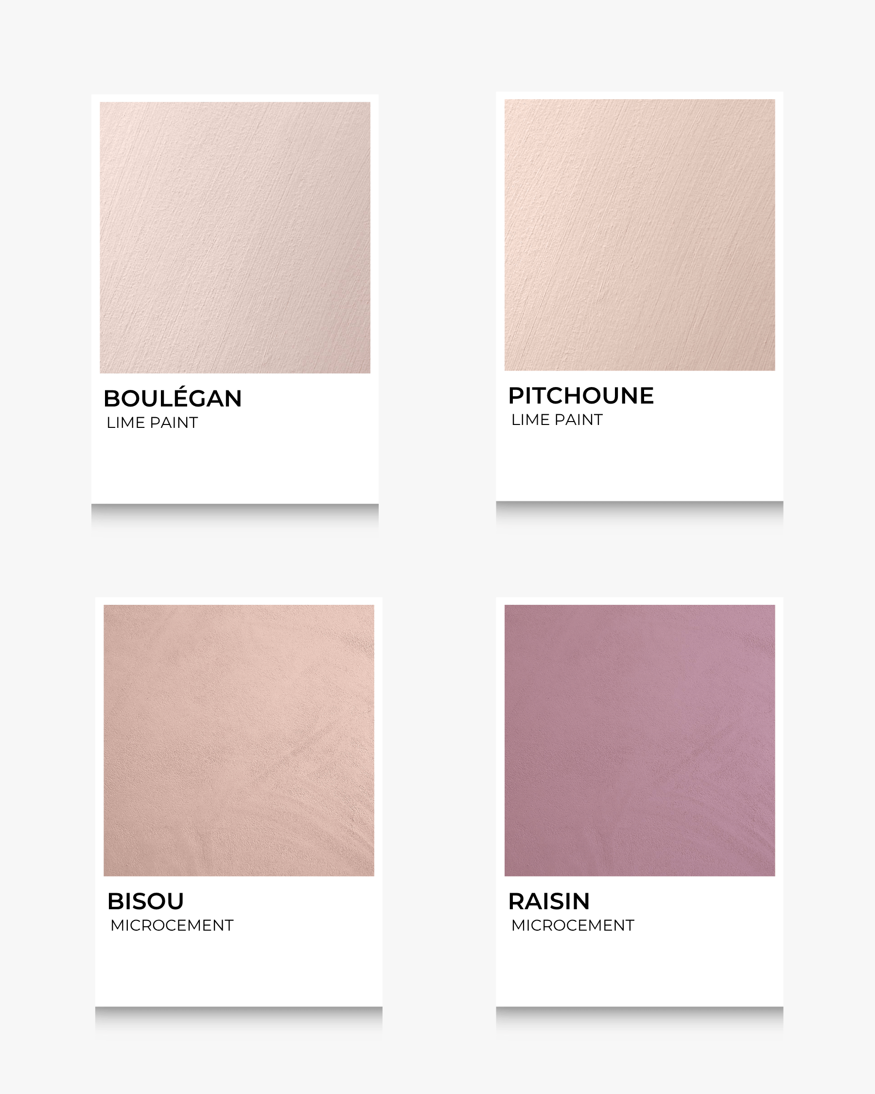
These tender, comforting shades draw from the softness of feminine energy—strong yet nurturing. Think dusty rose, mauve with grey undertones, and warm blush tones. These colours promote emotional warmth and connection, making them perfect for bedrooms, wellness spaces, or intimate lounges. Lime paint’s natural finish adds subtle elegance and keeps these hues feeling mature and grounded, rather than overly sweet.
Inspired by the earth’s quiet strength, this palette uses deep moss green, soft clay red, and warm bark brown. These tones evoke a connection to nature, grounding the energy of a room while inviting introspection. Ideal for meditation rooms, reading nooks, or entryways where a sense of rootedness is desired. With lime paint, these colours take on a beautiful, earthy patina.
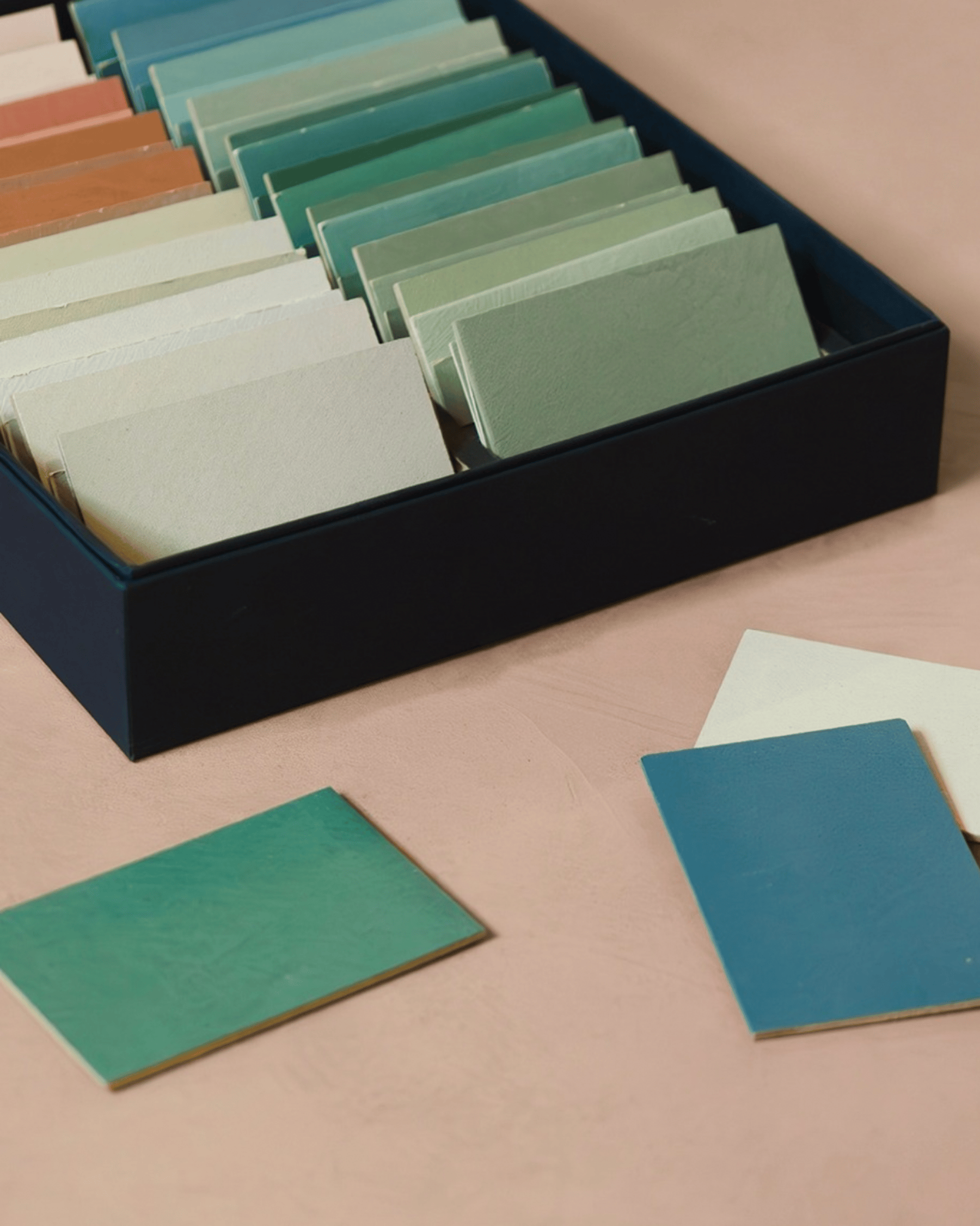
Sample generously: Lime paint behaves differently depending on lighting and surface texture. Always sample a large swatch on the actual wall.
Observe drying stages: Lime paint lightens and becomes smoother as it cures, so give it time before judging the final tone or sheen.
View at different times: Observe how the colour changes from morning to evening.
Pair with materials: Consider the whole room palette when testing.
Test on real surfaces: Like lime paint, microcement reacts to lighting and texture. Always apply a generous test patch on the actual floor or wall for accurate results.
Observe drying stages: Microcement darkens as it cures, so give it time before judging the final tone or sheen.
Seal smartly: The final colour can shift slightly after sealing—try samples with your chosen topcoat to ensure satisfaction.
Colour is not just a design choice—it’s an emotional one. By understanding the psychological effects of colour, you can harness its beauty to create a space that nurtures, energizes, or calms—whatever you need it to be.
Whether you're painting a cozy bedroom retreat or a lively dining space, let colour psychology guide your palette.
Choosing the perfect colour for your interior isn’t just about aesthetics, it’s also about how the space makes you feel. But which colour should you choose? And how will it influence the mood and atmosphere of your space?
Let’s explore the world of colour psychology and how it can help you choose the right shade for your walls.
Colours affect our emotions, energy levels, and even how spacious or cozy a room feels. When paired with the unique texture of lime paint, these psychological effects become more pronounced. That’s why understanding the emotional and psychological undertones of colours can help you design a space that truly reflects your intentions.
Here’s how to apply colour psychology to different lime paint shades depending on your room’s purpose:
Green is associated with balance, renewal, and calm. Sage and muted olive lime paints are ideal for bedrooms, studies, or any space where rest and restoration are key. The natural chalky look of lime paint enhances this sense of tranquility.
Rich terracotta and golden ochre tones evoke warmth and comfort, making them perfect for living rooms or kitchens. These hues can spark conversation, nurture creativity, and make a space feel grounded and homey.
If you want to add a touch of cheerfulness to a bathroom, hallway, or small nook, soft yellow or peach tones can help. These colours bring light and positivity, especially when illuminated by natural daylight on a lime-painted surface.
For a more modern, minimalist approach, cool greys or greige (a blend of grey and beige) offer a sense of calm and elegance. These colours work especially well in communal spaces or work areas where focus is essential.
Dark, moody shades like navy or charcoal create intimacy and reflection. They are well-suited for dramatic dining rooms, cozy reading corners, or creative studios. Lime paint’s natural variation brings these deep colours to life with texture and depth.
For spaces that need a versatile and grounding backdrop, lime paint in stone, sand, or mushroom tones brings timeless elegance. These shades are especially effective in open-plan areas where warmth and neutrality are equally important.
For those looking to make a bold, characterful statement, rich shades like deep burgundy, moody plum, or emerald green offer personality and power. Lime paint softens their intensity with texture, giving the space a dramatic yet sophisticated edge.
Blue-green tones evoke the freshness of sky and sea—perfect for bathrooms, creative spaces, or anywhere you want a breath of fresh air. Dusty blues and teals feel both calming and energizing, and lime paint adds a dreamlike softness to their cool charm.
These tender, comforting shades draw from the softness of feminine energy—strong yet nurturing. Think dusty rose, mauve with grey undertones, and warm blush tones. These colours promote emotional warmth and connection, making them perfect for bedrooms, wellness spaces, or intimate lounges. Lime paint’s natural finish adds subtle elegance and keeps these hues feeling mature and grounded, rather than overly sweet.
Inspired by the earth’s quiet strength, this palette uses deep moss green, soft clay red, and warm bark brown. These tones evoke a connection to nature, grounding the energy of a room while inviting introspection. Ideal for meditation rooms, reading nooks, or entryways where a sense of rootedness is desired. With lime paint, these colours take on a beautiful, earthy patina.
Sample generously: Lime paint behaves differently depending on lighting and surface texture. Always sample a large swatch on the actual wall.
Observe drying stages: Lime paint lightens and becomes smoother as it cures, so give it time before judging the final tone or sheen.
View at different times: Observe how the colour changes from morning to evening.
Pair with materials: Consider the whole room palette when testing.
Test on real surfaces: Like lime paint, microcement reacts to lighting and texture. Always apply a generous test patch on the actual floor or wall for accurate results.
Observe drying stages: Microcement darkens as it cures, so give it time before judging the final tone or sheen.
Seal smartly: The final colour can shift slightly after sealing—try samples with your chosen topcoat to ensure satisfaction.
Colour is not just a design choice—it’s an emotional one. By understanding the psychological effects of colour, you can harness its beauty to create a space that nurtures, energizes, or calms—whatever you need it to be.
Whether you're painting a cozy bedroom retreat or a lively dining space, let colour psychology guide your palette.