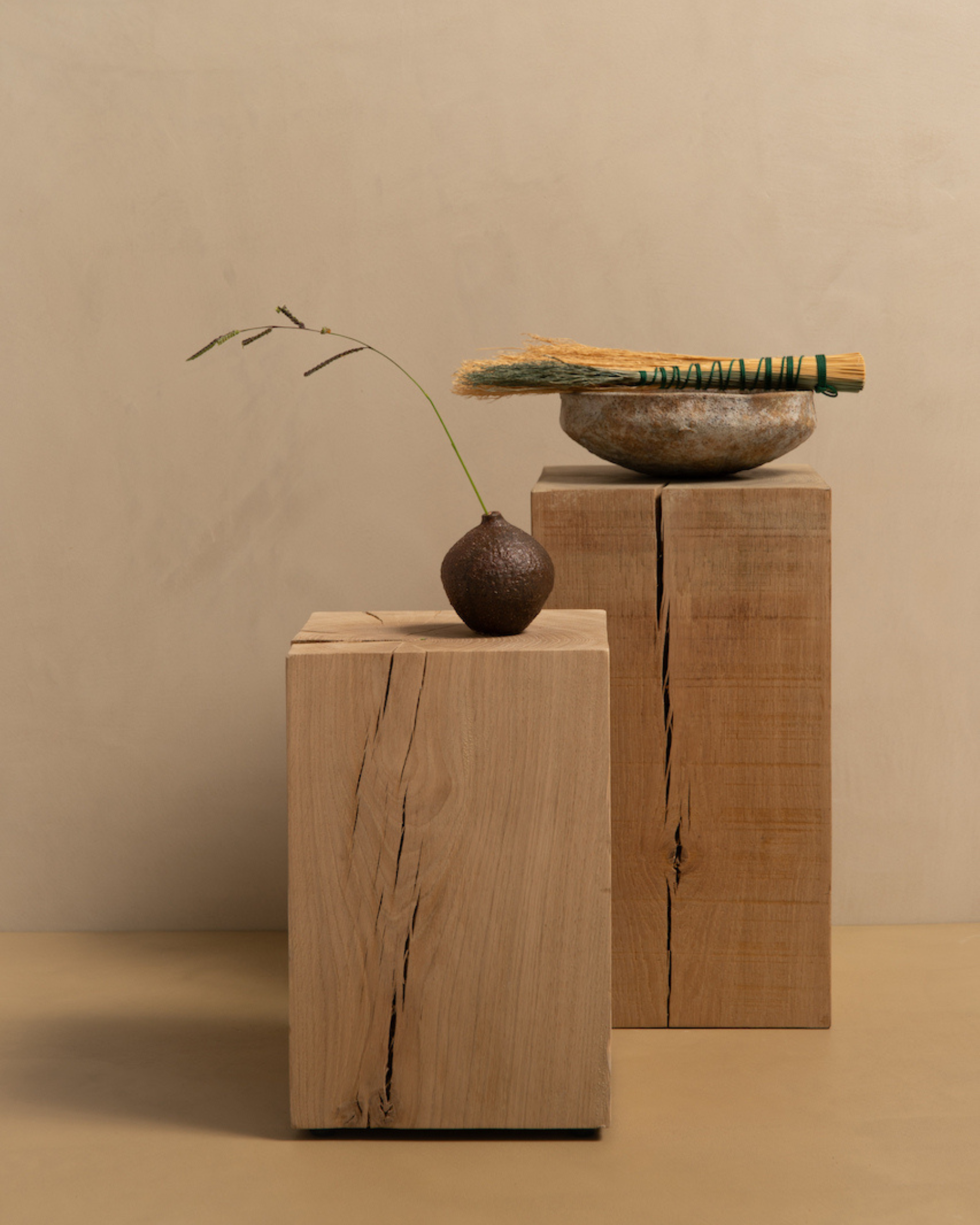
There is a quiet confidence in colour when it is chosen with intention. Jewel tones—deep, saturated, and full of character—have long been associated with richness and depth, yet when paired with microcement, they take on a new, contemporary softness.
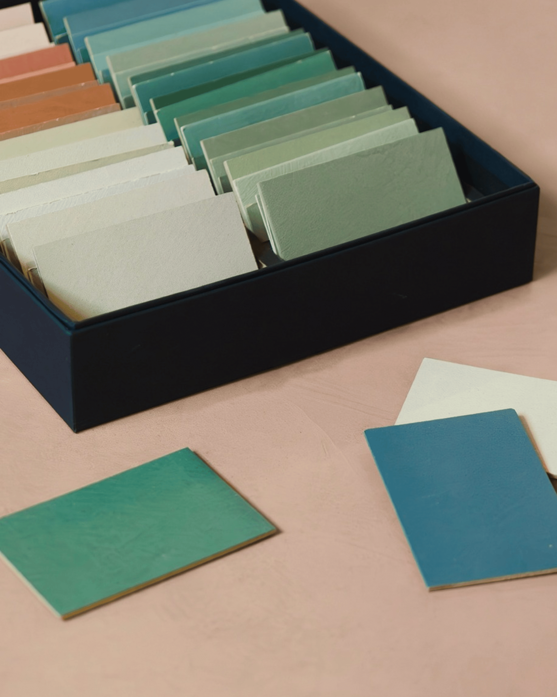
Microcement is often celebrated for its neutral, minimalist appeal. Yet beyond soft beiges, off-whites, and pale greys lies a world of colour that is just as timeless. Jewel tones introduce emotion, warmth, and personality, transforming seamless surfaces into expressive yet balanced interiors.
This article explores how coloured microcement can bring depth and elegance to both residential and commercial spaces, without visual excess.
We hope it inspires you to move beyond neutrals and explore bolder choices.
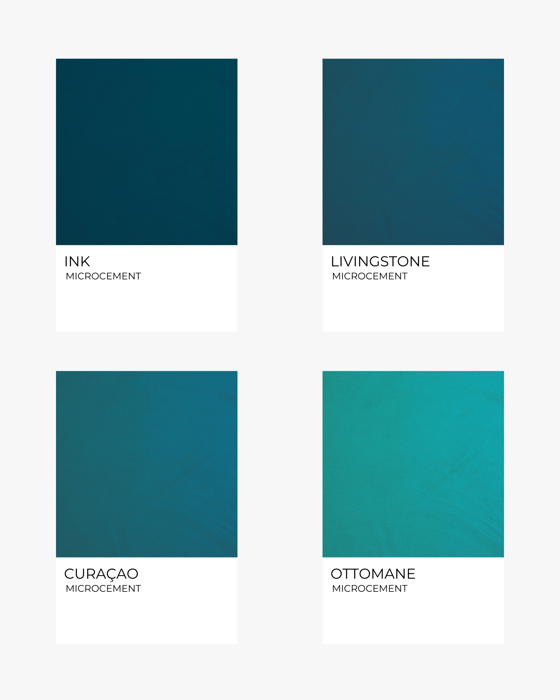
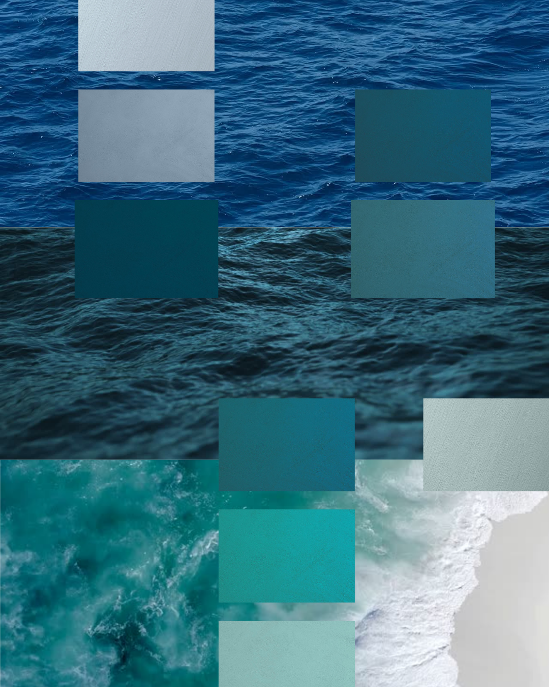
Deep blues are inherently calming, evoking water, twilight skies, and mineral depth. When expressed through microcement, sapphire and teal blues take on a distinctly architectural quality—smooth, seamless, and quietly confident. Their depth enhances microcement’s continuous surface, creating spaces that feel expansive yet contained, particularly when light moves softly across the matte finish.
These tones are especially effective in environments where serenity and clarity are key, lending themselves to both private rituals and shared experiences.
Best for: Bathrooms, wet rooms, statement floors, and commercial interiors.
Pairs well with: Pale stone, soft whites, chrome or brushed steel finishes.
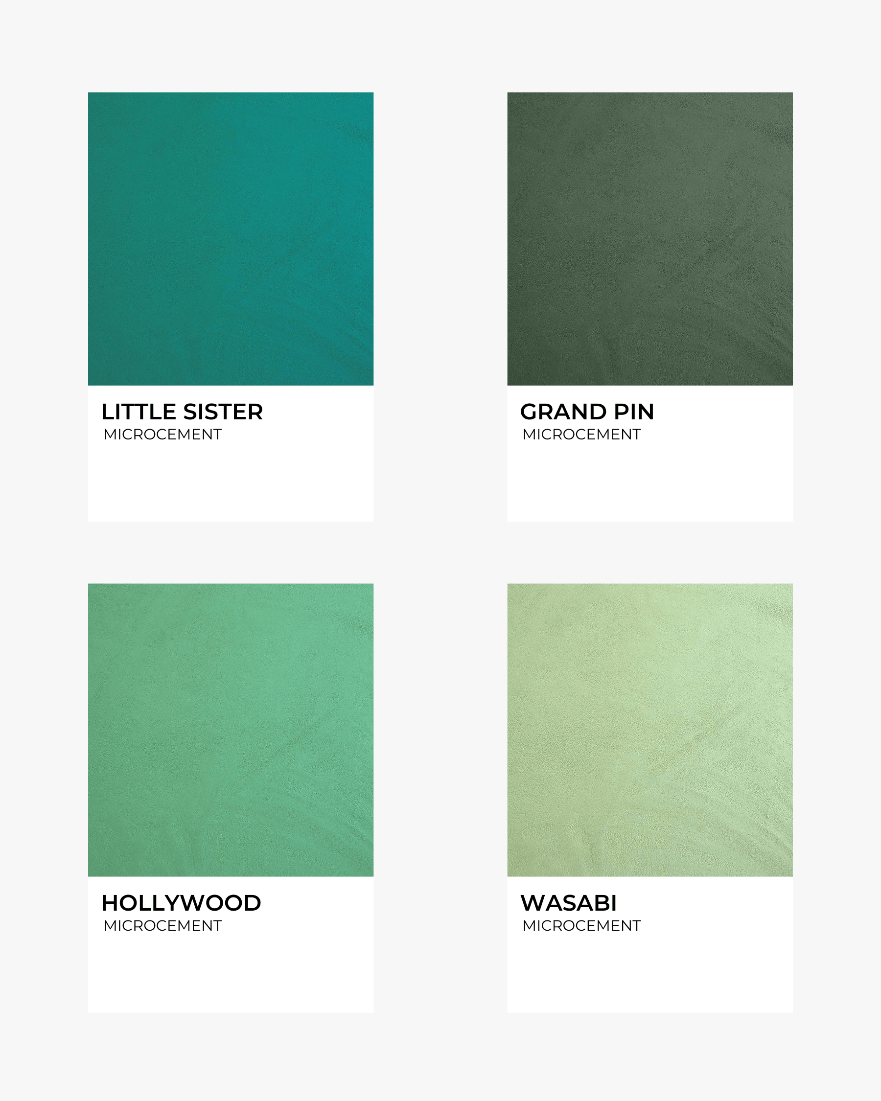
Deep greens draw directly from nature—dense foliage, moss-covered stone, shaded gardens. In microcement, emerald and sapphire greens become enveloping and grounding, offering a sense of protection and calm without visual heaviness. Their organic depth pairs beautifully with the material’s mineral texture, creating interiors that feel both restorative and refined.
These hues work equally well in residential and commercial settings, where a connection to nature enhances comfort and well-being.
Best for: Kitchens, entryways, bathrooms, powder rooms, feature walls, and wellness spaces.
Pairs well with: Warm woods, brushed brass, muted creams, clay ceramics.
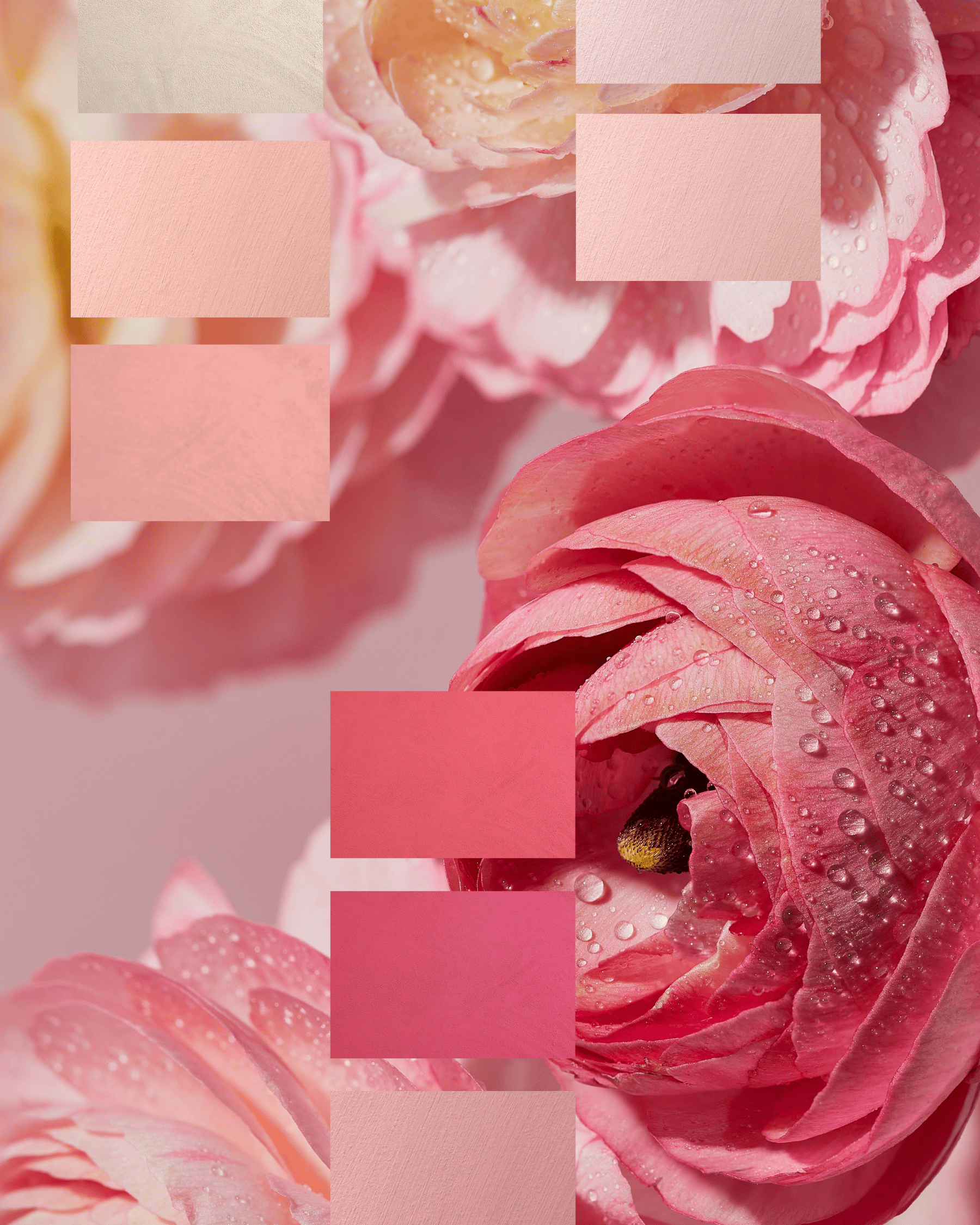
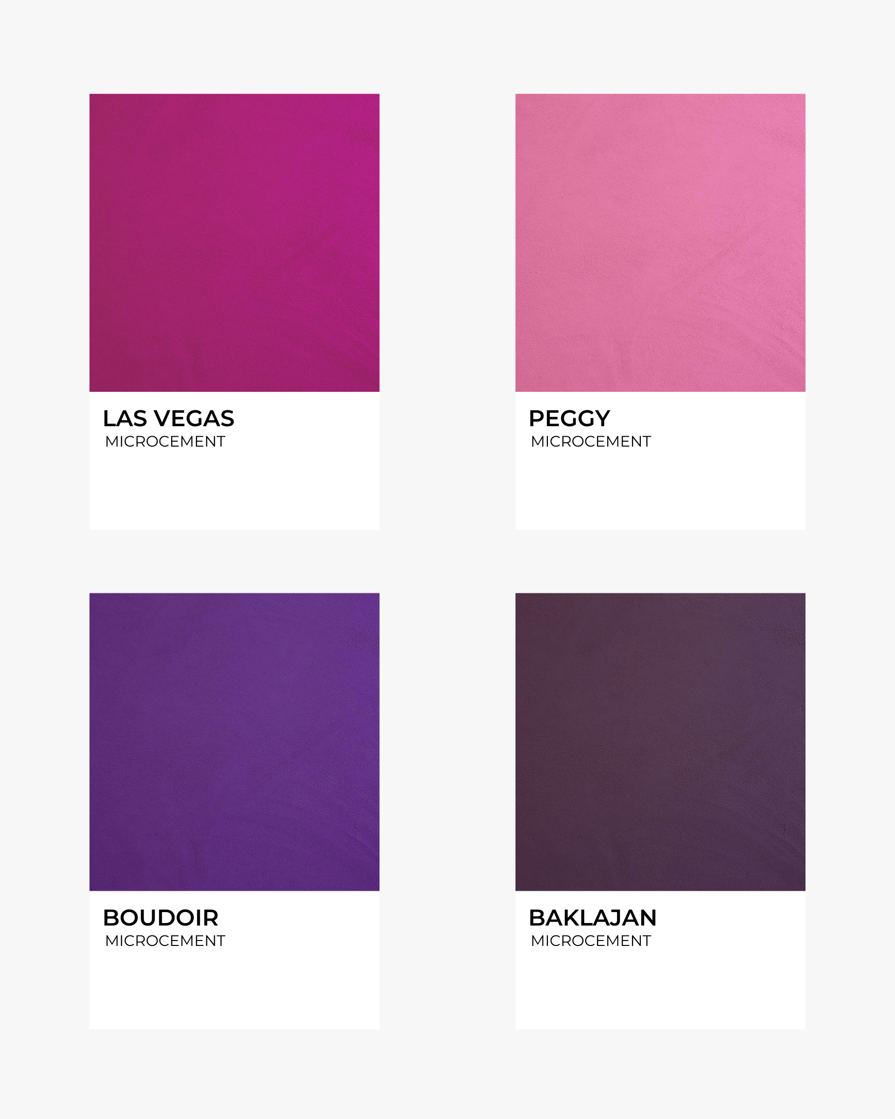
Plum, magenta, and amethyst tones introduce softness with a luxurious edge. Rich yet restrained, these colours are softened by microcement’s matte finish, allowing depth without excess. The result is an atmosphere that feels intimate and composed—never theatrical, always intentional.
These hues thrive in spaces designed for pause and retreat, where mood and materiality take precedence over brightness.
Best for: Bedrooms, dressing rooms, alcoves, boutique or hospitality spaces.
Pairs well with: Greige, mushroom tones, bronze finishes, deep greens.
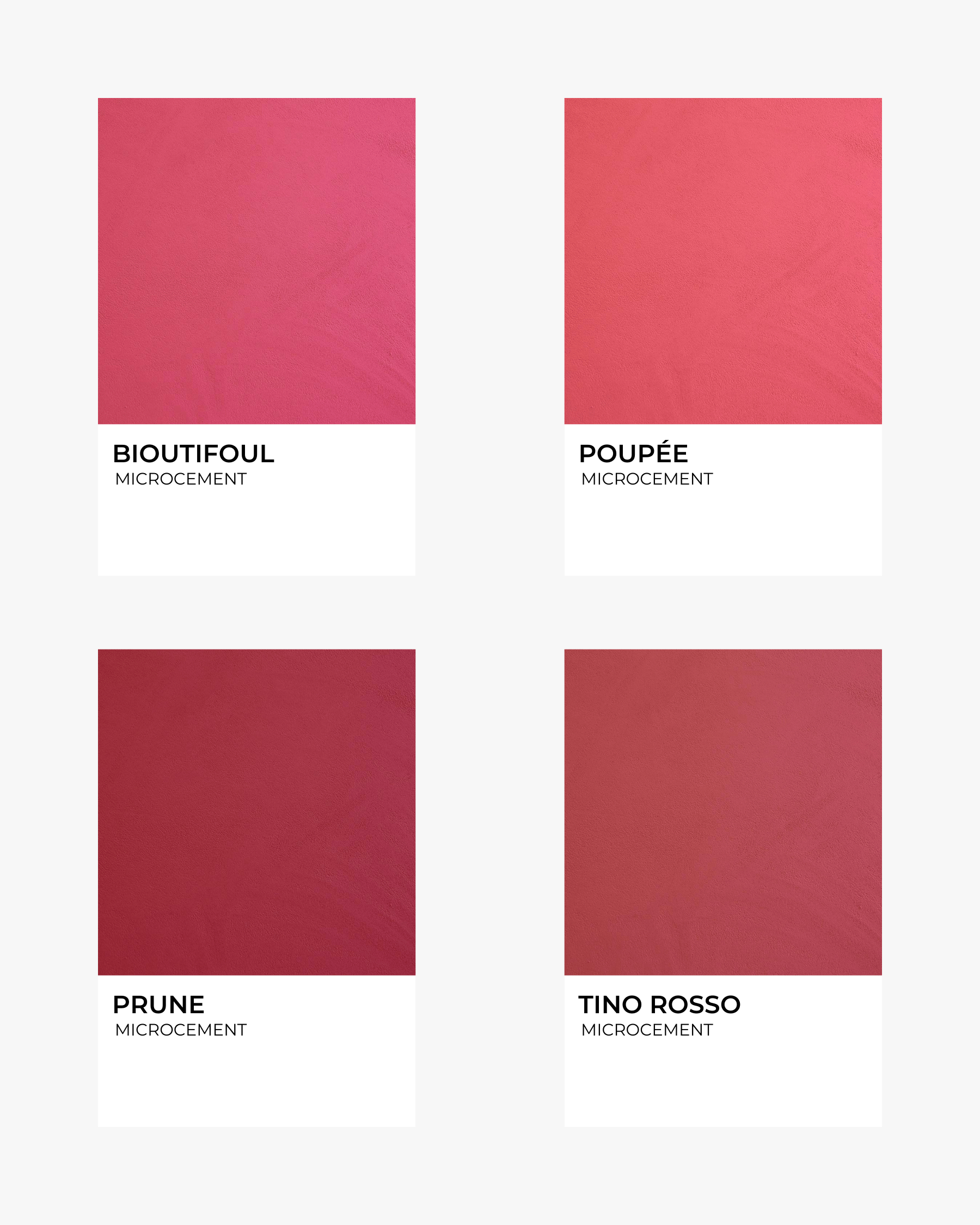
Inspired by gemstones and aged wine tones, ruby reds bring warmth and vitality to interiors. In microcement, these colours are naturally grounded by the material’s mineral quality, resulting in a richness that feels expressive yet controlled. They add character and presence without overwhelming the space.
Ideal for areas meant to encourage conversation and creativity, ruby reds bring energy while remaining refined.
Best for: Accent walls, dining areas, libraries, creative or retail interiors.
Pairs well with: Deep browns, muted golds, soft whites, natural linens.
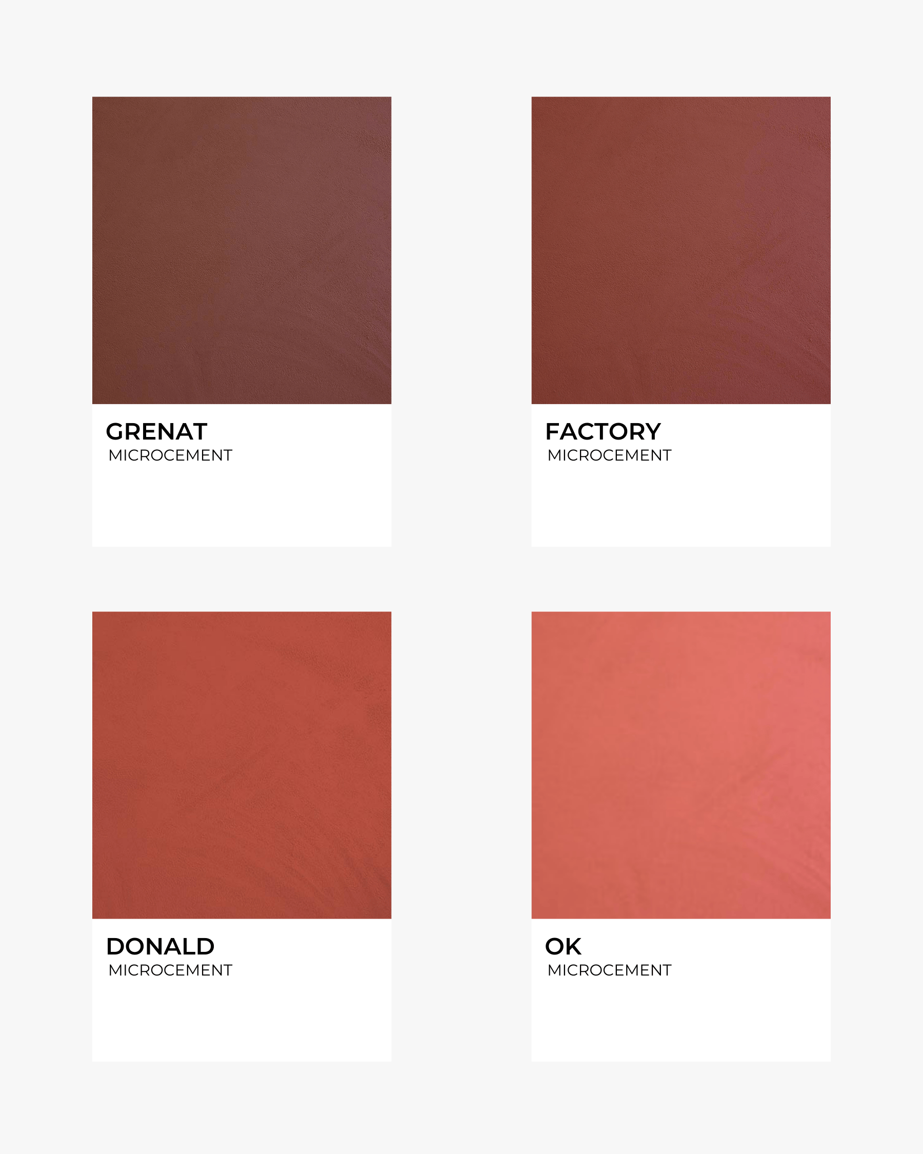
Sitting between red and brown, garnet and burgundy tones offer depth with an earthy undertone. In microcement, they read as architectural and comforting—perfect for anchoring large surfaces. Their richness brings warmth while maintaining a sense of visual cohesion, especially in expansive interiors.
These tones excel in spaces where continuity and atmosphere matter most.
Best for: Living rooms, open-plan spaces, restaurants, reception areas.
Pairs well with: Creamy whites, olive greens, brass details, textured fabrics.
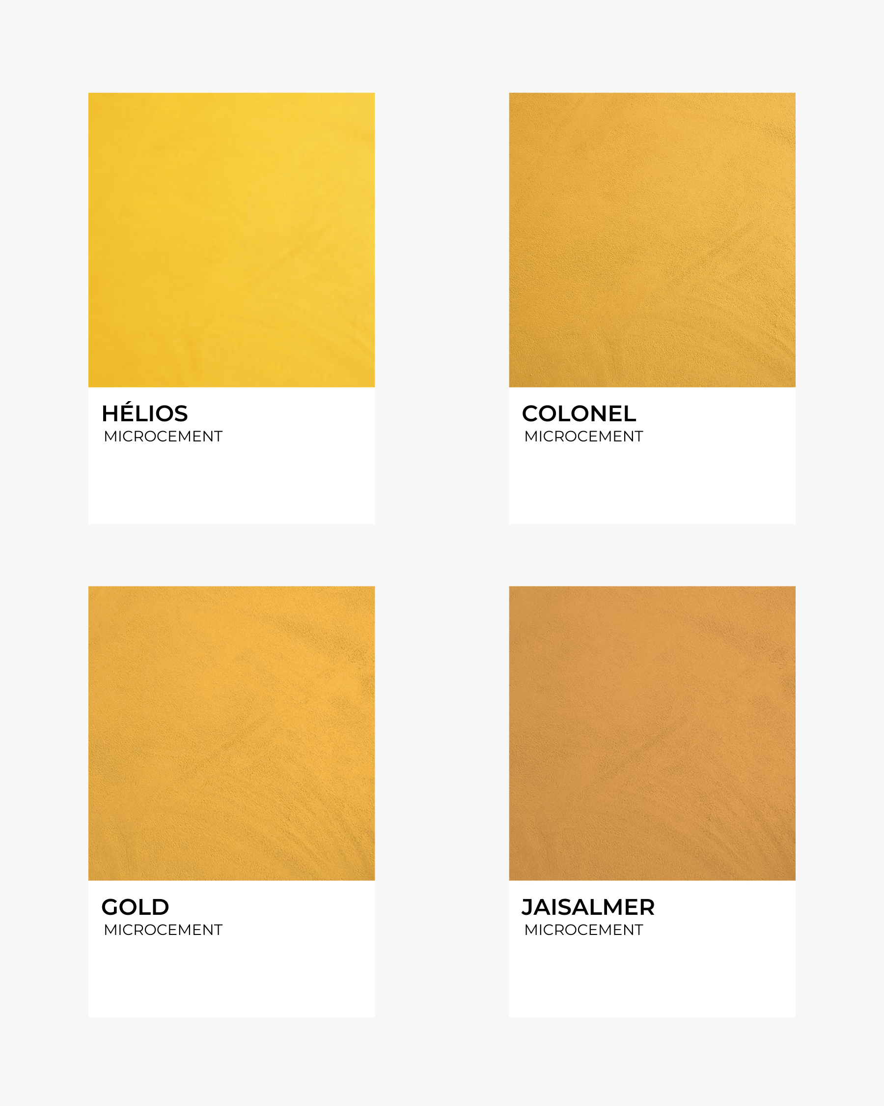
Golden yellows introduce light and warmth in a way that feels natural rather than bright. Inspired by amber, aged brass, and mineral pigments, these tones glow softly when applied in microcement, their vibrancy tempered by the matte surface. They bring optimism and energy while remaining grounded and sophisticated.
These hues are particularly effective in spaces that benefit from warmth and welcome, both in private homes and professional environments.
Best for: Kitchens, entryways, sunlit rooms, cafés, creative spaces, healing studios.
Pairs well with: Warm woods, terracotta, creamy whites, natural textiles.
Jewel tones and microcement may seem like opposites—one expressive, the other minimalist—but together they create balance. Microcement’s seamless, matte surface tempers saturated colour, allowing depth without excess and richness without ornament.
Whether used in a private home or a commercial setting, coloured microcement offers durability, moisture resistance, and ease of maintenance, while opening the door to more expressive design choices.
Colour and minimalism don’t compete—they enhance one another.
Cover photo credit: Mercadier

There is a quiet confidence in colour when it is chosen with intention. Jewel tones—deep, saturated, and full of character—have long been associated with richness and depth, yet when paired with microcement, they take on a new, contemporary softness.
Microcement is often celebrated for its neutral, minimalist appeal. Yet beyond soft beiges, off-whites, and pale greys lies a world of colour that is just as timeless. Jewel tones introduce emotion, warmth, and personality, transforming seamless surfaces into expressive yet balanced interiors.
This article explores how coloured microcement can bring depth and elegance to both residential and commercial spaces, without visual excess.
We hope it inspires you to move beyond neutrals and explore bolder choices.
Deep blues are inherently calming, evoking water, twilight skies, and mineral depth. When expressed through microcement, sapphire and teal blues take on a distinctly architectural quality—smooth, seamless, and quietly confident. Their depth enhances microcement’s continuous surface, creating spaces that feel expansive yet contained, particularly when light moves softly across the matte finish.
These tones are especially effective in environments where serenity and clarity are key, lending themselves to both private rituals and shared experiences.
Best for: Bathrooms, wet rooms, statement floors, and commercial interiors.
Pairs well with: Pale stone, soft whites, chrome or brushed steel finishes.
Deep greens draw directly from nature—dense foliage, moss-covered stone, shaded gardens. In microcement, emerald and sapphire greens become enveloping and grounding, offering a sense of protection and calm without visual heaviness. Their organic depth pairs beautifully with the material’s mineral texture, creating interiors that feel both restorative and refined.
These hues work equally well in residential and commercial settings, where a connection to nature enhances comfort and well-being.
Best for: Kitchens, entryways, bathrooms, powder rooms, feature walls, and wellness spaces.
Pairs well with: Warm woods, brushed brass, muted creams, clay ceramics.
Plum, magenta, and amethyst tones introduce softness with a luxurious edge. Rich yet restrained, these colours are softened by microcement’s matte finish, allowing depth without excess. The result is an atmosphere that feels intimate and composed—never theatrical, always intentional.
These hues thrive in spaces designed for pause and retreat, where mood and materiality take precedence over brightness.
Best for: Bedrooms, dressing rooms, alcoves, boutique or hospitality spaces.
Pairs well with: Greige, mushroom tones, bronze finishes, deep greens.
Inspired by gemstones and aged wine tones, ruby reds bring warmth and vitality to interiors. In microcement, these colours are naturally grounded by the material’s mineral quality, resulting in a richness that feels expressive yet controlled. They add character and presence without overwhelming the space.
Ideal for areas meant to encourage conversation and creativity, ruby reds bring energy while remaining refined.
Best for: Accent walls, dining areas, libraries, creative or retail interiors.
Pairs well with: Deep browns, muted golds, soft whites, natural linens.
Sitting between red and brown, garnet and burgundy tones offer depth with an earthy undertone. In microcement, they read as architectural and comforting—perfect for anchoring large surfaces. Their richness brings warmth while maintaining a sense of visual cohesion, especially in expansive interiors.
These tones excel in spaces where continuity and atmosphere matter most.
Best for: Living rooms, open-plan spaces, restaurants, reception areas.
Pairs well with: Creamy whites, olive greens, brass details, textured fabrics.
Golden yellows introduce light and warmth in a way that feels natural rather than bright. Inspired by amber, aged brass, and mineral pigments, these tones glow softly when applied in microcement, their vibrancy tempered by the matte surface. They bring optimism and energy while remaining grounded and sophisticated.
These hues are particularly effective in spaces that benefit from warmth and welcome, both in private homes and professional environments.
Best for: Kitchens, entryways, sunlit rooms, cafés, creative spaces, healing studios.
Pairs well with: Warm woods, terracotta, creamy whites, natural textiles.
Jewel tones and microcement may seem like opposites—one expressive, the other minimalist—but together they create balance. Microcement’s seamless, matte surface tempers saturated colour, allowing depth without excess and richness without ornament.
Whether used in a private home or a commercial setting, coloured microcement offers durability, moisture resistance, and ease of maintenance, while opening the door to more expressive design choices.
Colour and minimalism don’t compete—they enhance one another.
Cover photo credit: Mercadier