At Maison Anna B, we often speak of colour not just as decoration, but as an emotional language, a way to bring poetry and balance into everyday spaces. Today, we are delighted to introduce Ōdo, the latest colour collection born of a long-standing collaboration between Mercadier and French design studio Heju.
This partnership, grounded in a shared reverence for raw materials, timeless expression and texture, has given rise to a collection that feels both meditative and deeply rooted in place. Heju, founded by Hélène Pinaud and Julien Schwartzmann, has been a trusted partner of Mercadier for years, regularly highlighting Mercadier’s microcement products in its architecture and design projects. Their collective vision, a celebration of material authenticity and refined simplicity, naturally led to the creation of something greater than the sum of its parts.
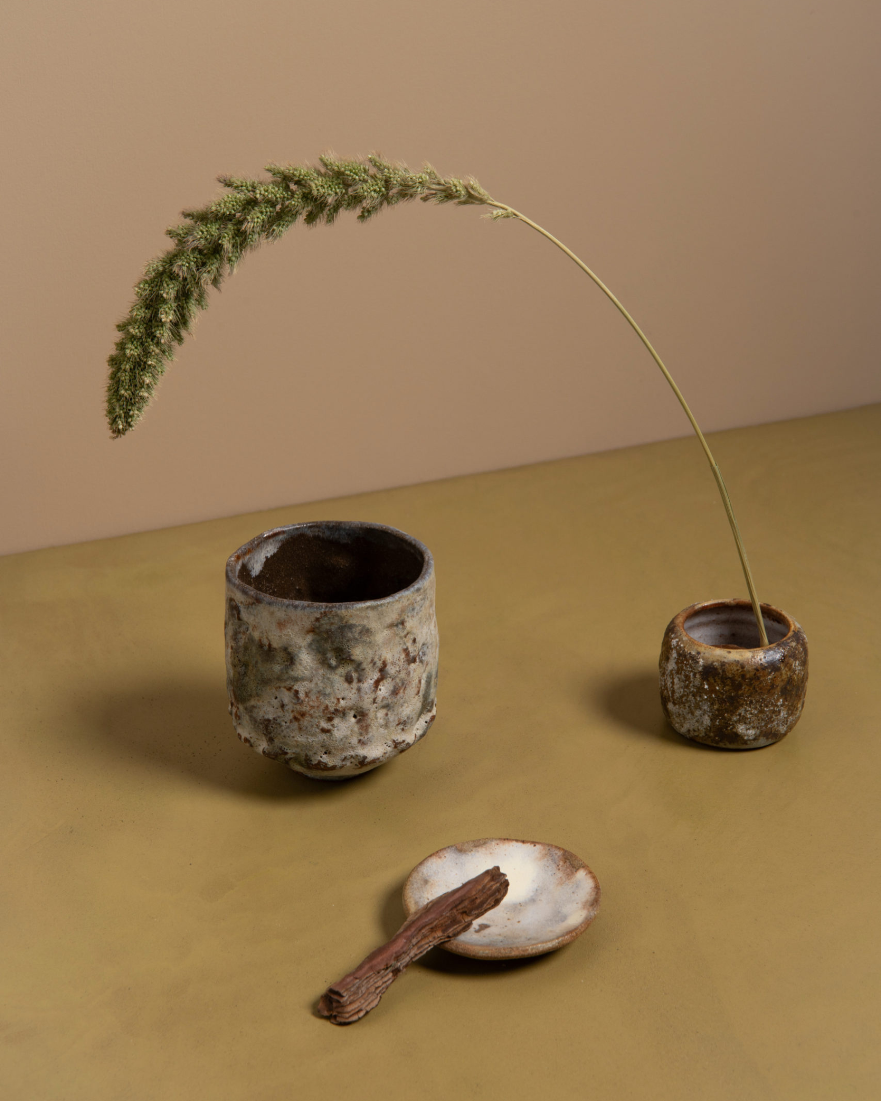
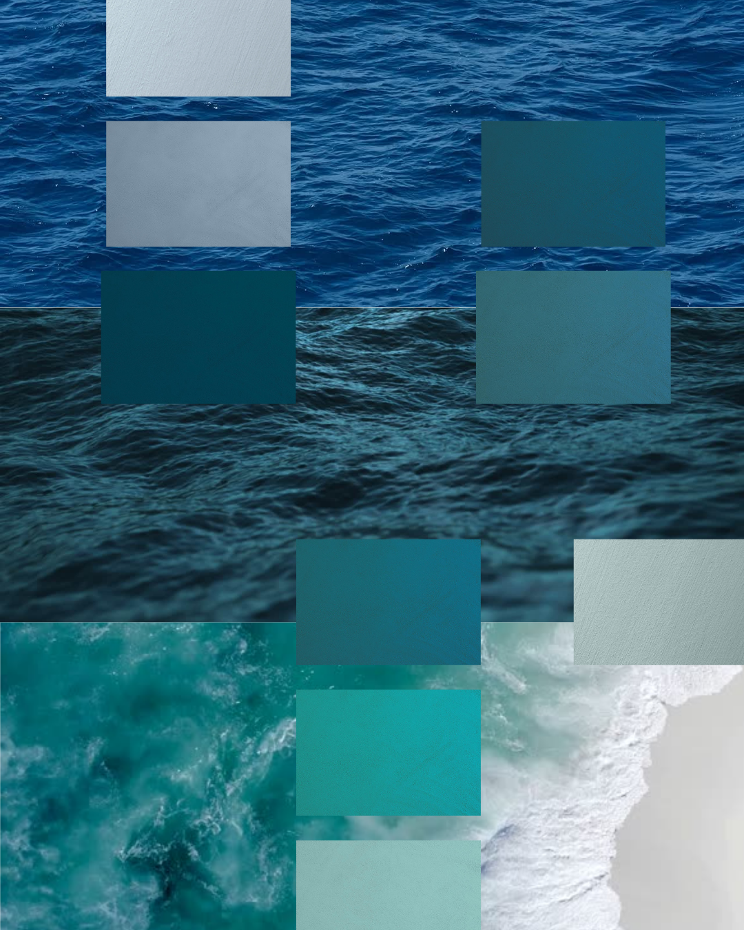
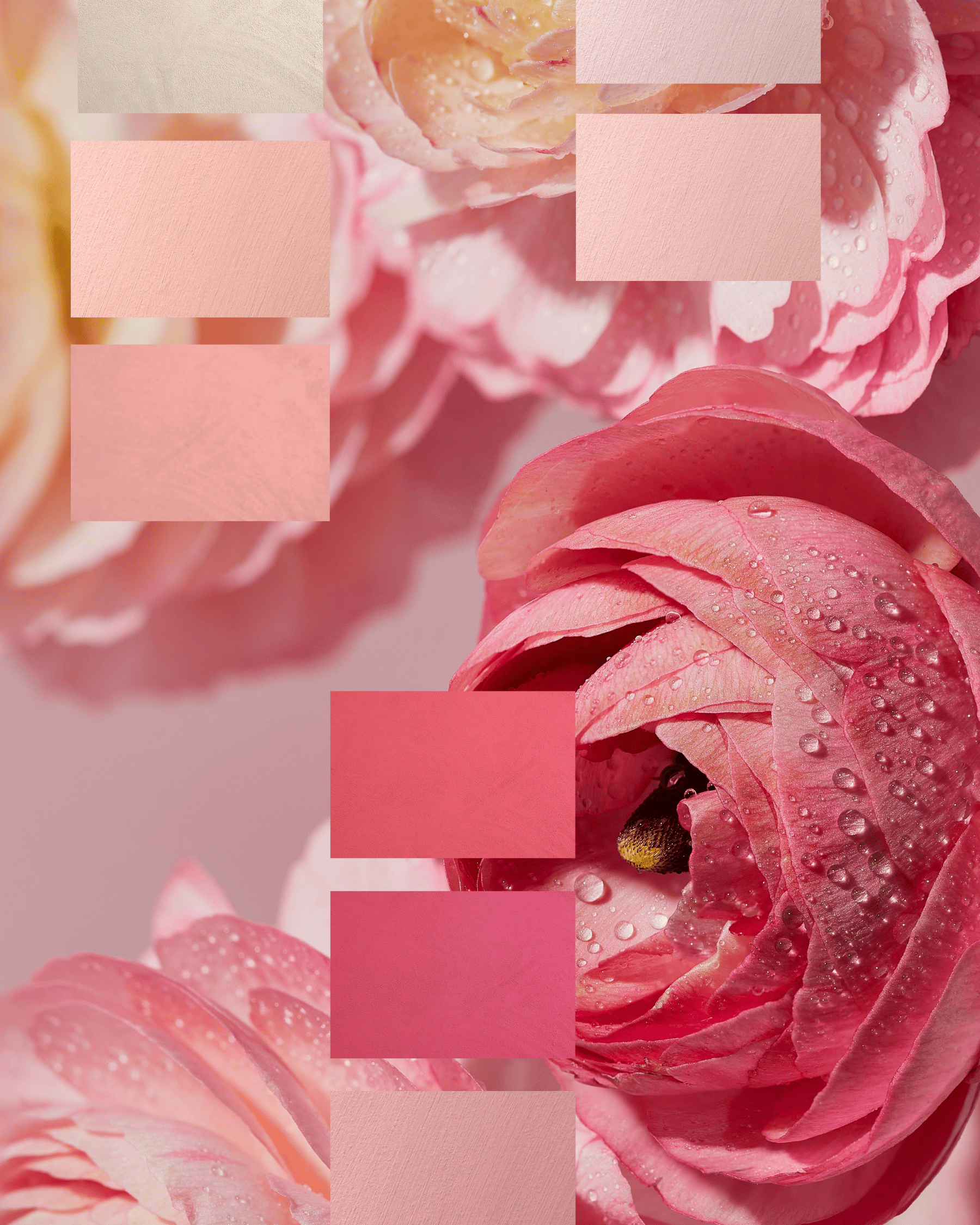
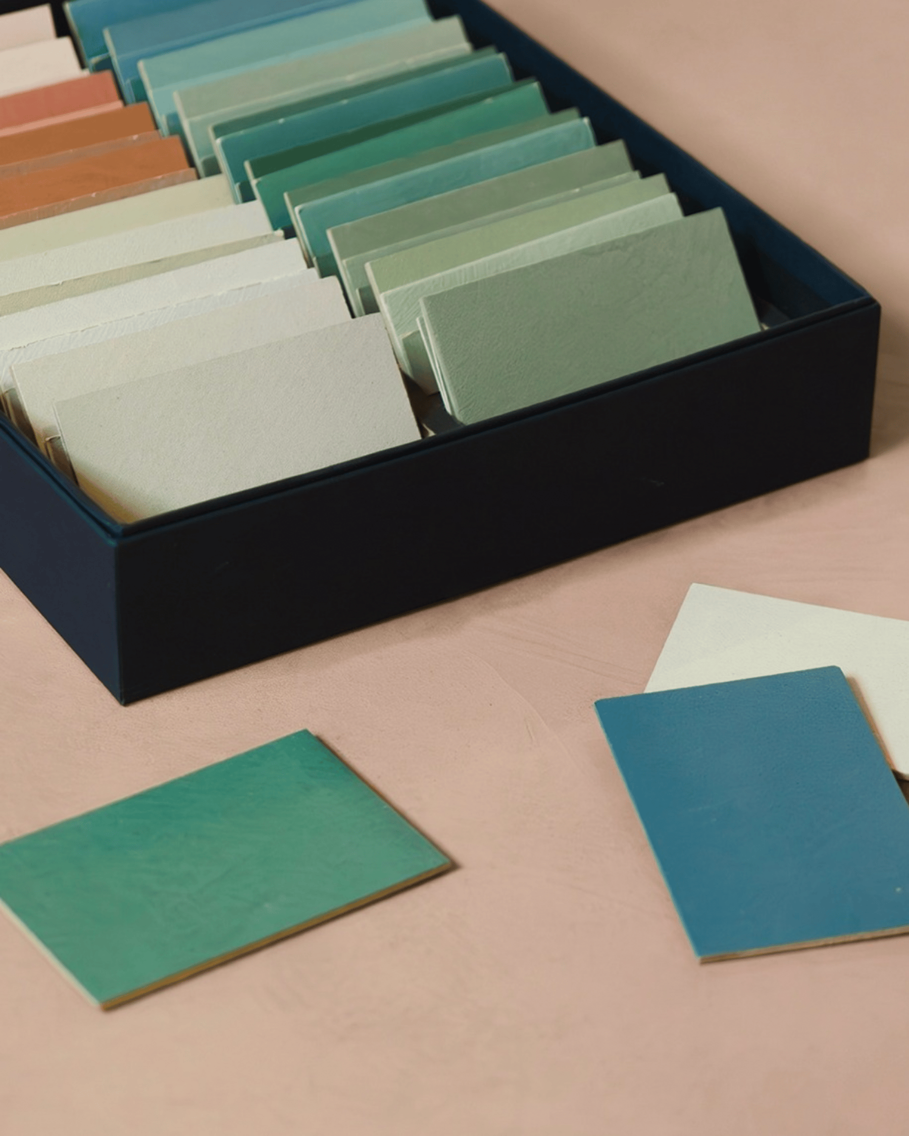
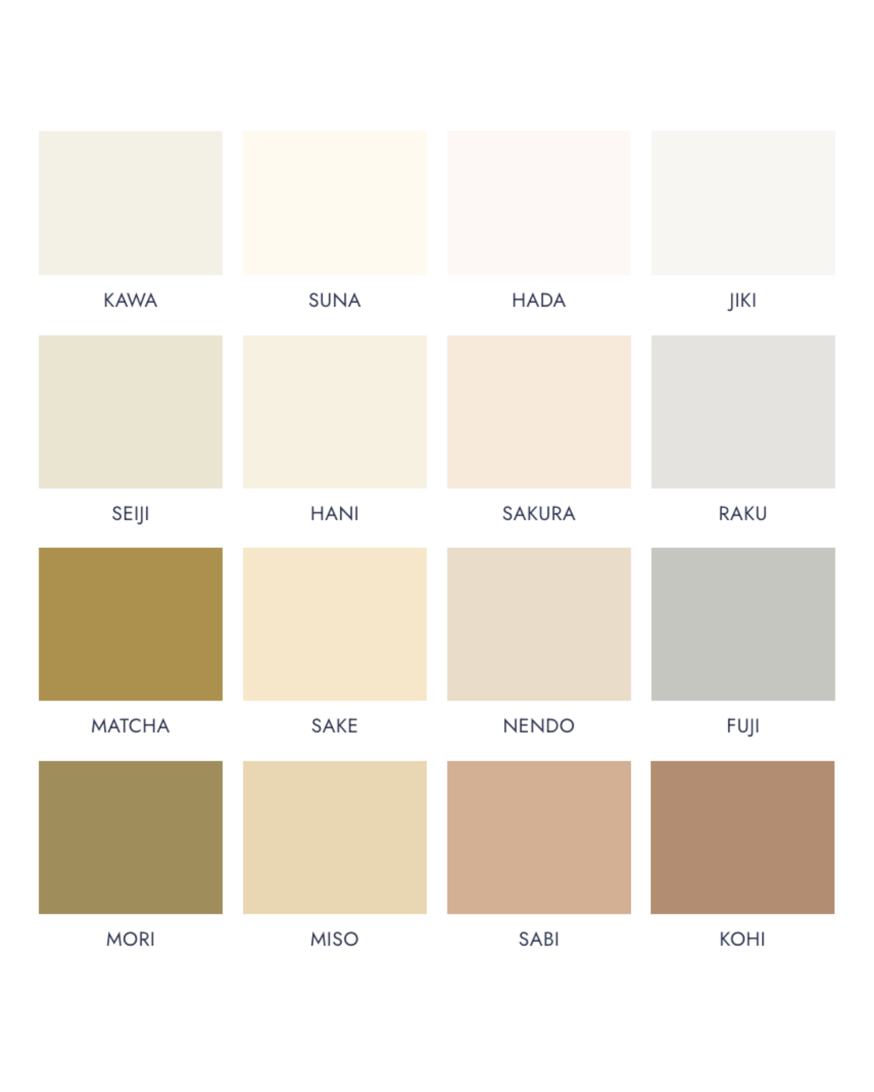
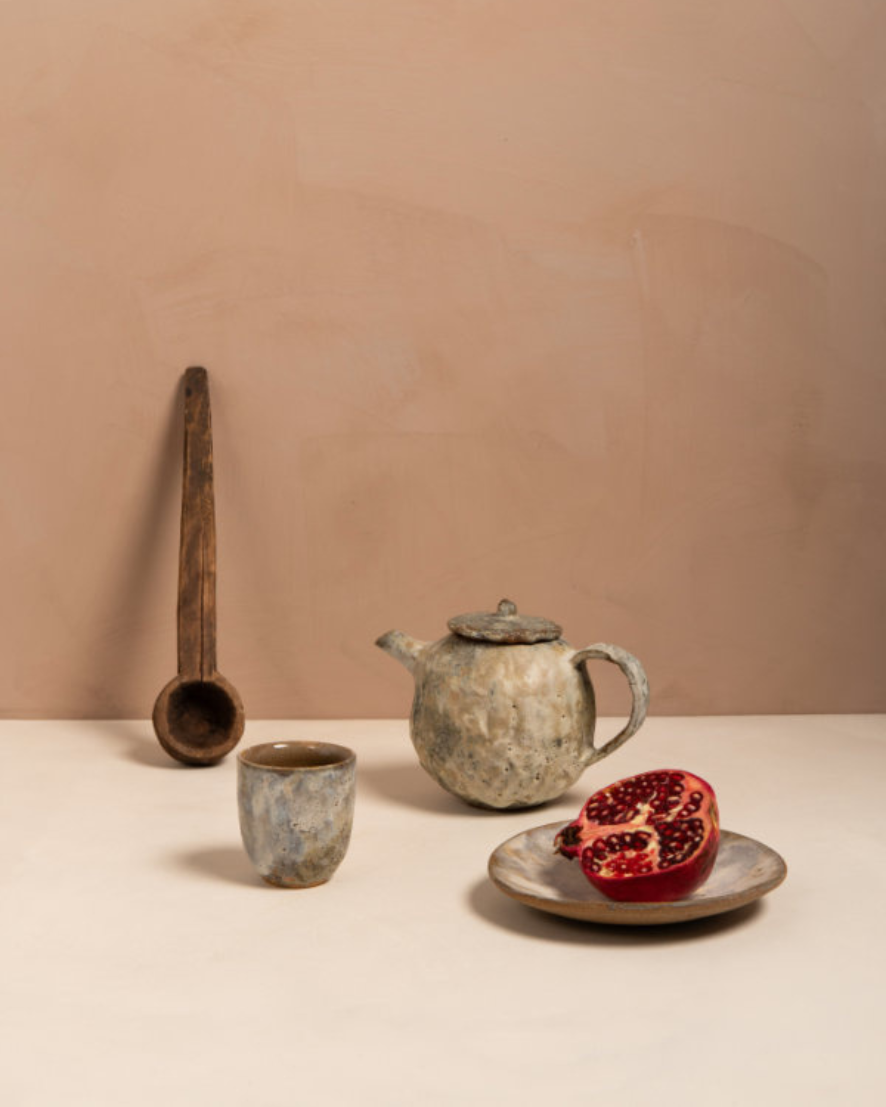
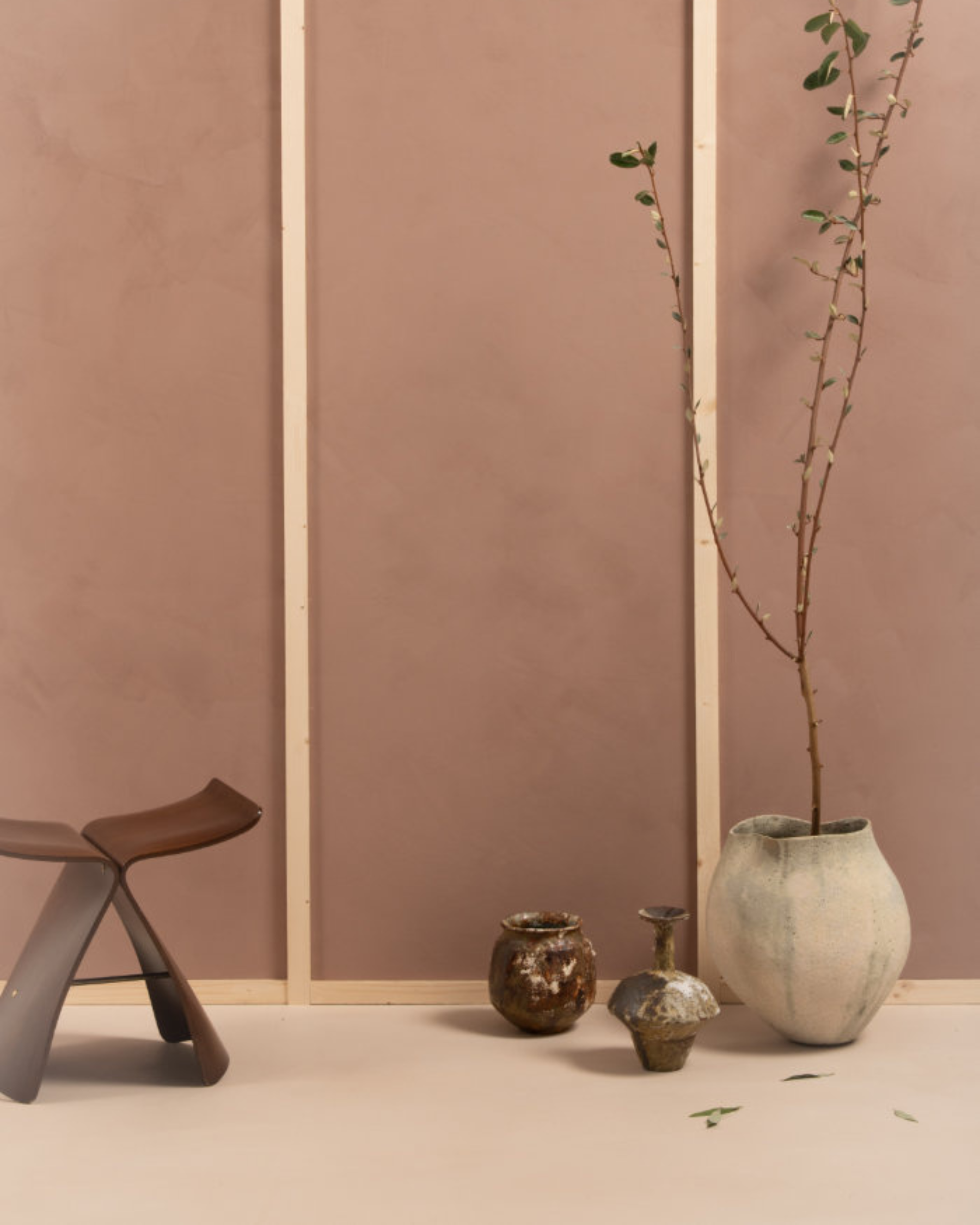
Ōdo brings together 16 nuanced shades, each one inspired by the subtle beauty and mindful aesthetic of Japan’s landscapes and traditional crafts. From the blue-grey of Mount Fuji under snow to sandy earth tones, the delicate rose of cherry blossoms and grounded organic greens, every colour feels like a fragment of nature, an emotion, a memory, a quiet moment of clarity.
KAWA – Light beige with a subtle green undertone.
SUNA – Light, fresh sandy beige.
HADA – Light beige with a subtle rosy undertone.
JIKI – Porcelain grey, almost translucent. A grey so light it’s nearly white.
SEIJI – Ligh stone tone, with a subtle hint of sage green.
HANI – Light sandy beige with a soft honey warmth.
SAKURA – Fresh rosy beige inspired by dried cherry blossom.
RAKU – Light blue-grey inspired by ancestral Japanese ceramics.
MATCHA – Meditative tea green with a subtle brown undertone.
SAKE – Light beige, with a soft yellow undertone.
NENDO – Light clay with a subtle rosy-beige tone.
FUJI – Blue-grey tone inspired by the snow-capped peak of Mount Fuji.
MORI – Organic moss green inspired by Japanese gardens.
MISO – Delicate warm beige.
SABI – Muted rosy terracotta.
KOHI – Earthy coffee tinged with pink.
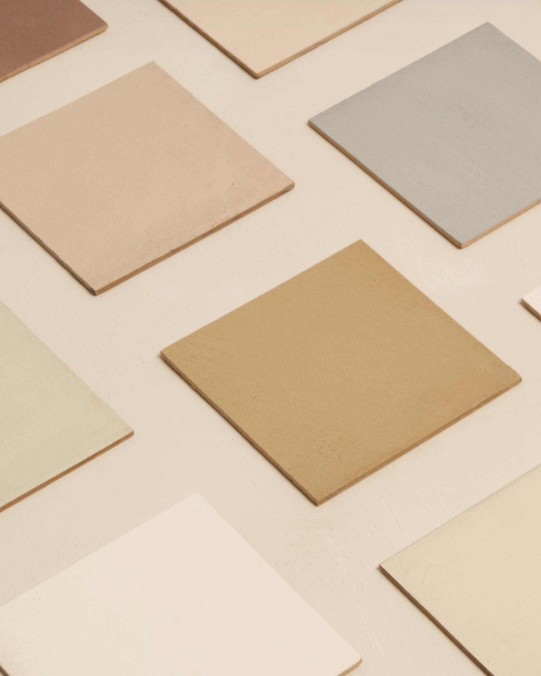
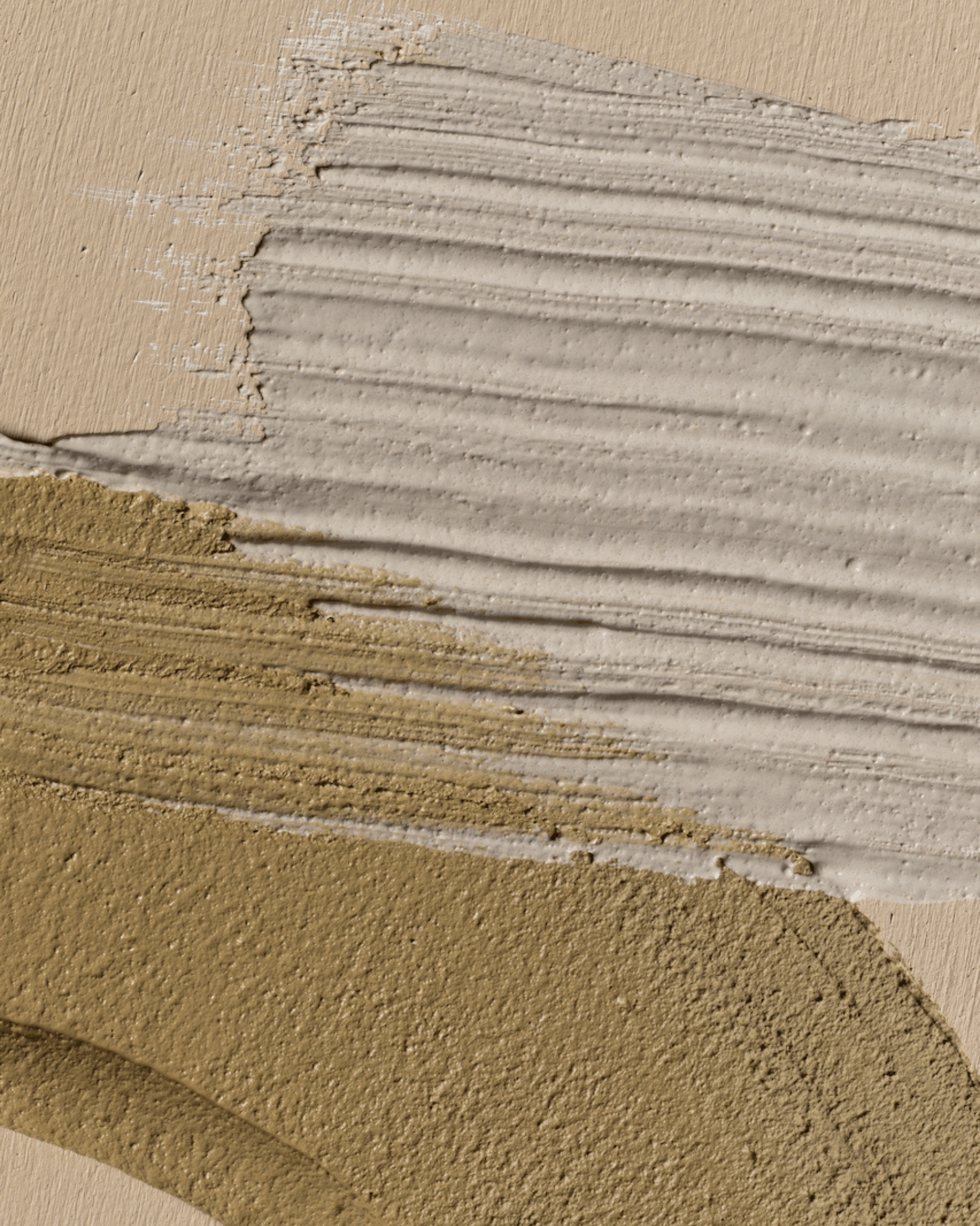
Available in microcement, lime paint and paint finishes, these shades invite us to explore how light and material interact, how colour can change mood and atmosphere, and how spaces can be both serene and deeply expressive.
The name Ōdo, meaning “ochre” in Japanese, reflects the influence of traditional Tsuchi-kabe — earthen walls crafted from clay, sand, straw and seaweed that have long defined the quiet harmony of Kyoto’s machiyas and other vernacular spaces. Mercadier and Heju’s interpretation captures the essence of this ancestral technique, translating its balance, tactility and calm into a contemporary palette that speaks to the soul of a room.
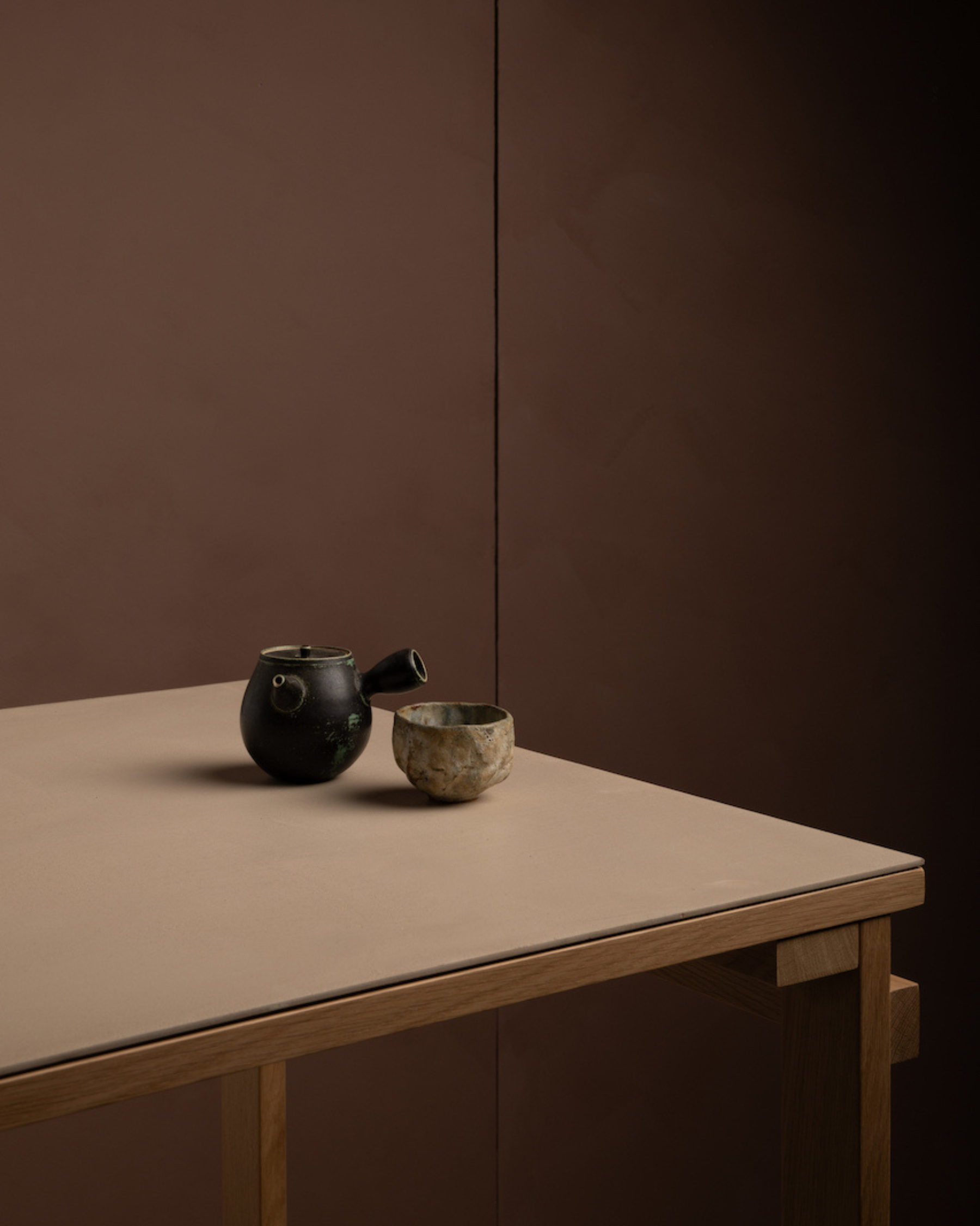
In these tones, we find not just colour, but stillness; not just surface, but depth. They are colours that evolve with the day, that invite contemplation, that make a house feel like a refuge.
At Maison Anna B, we believe that the spaces we inhabit shape how we feel and how we live. Ōdo is more than a palette, it’s an invitation to inhabit your home with intention, to craft interiors that are both personal and poetic.
Whether you’re envisioning a serene bedroom bathed in soft earth tones, a living space grounded in rich materiality, or a kitchen that whispers warmth and quiet joy, our team is here to help you discover the Ōdo shade and finish that speaks to your vision.
Welcome Ōdo into your home, and let colour become an expression of calm, beauty and life lived with grace.
Photo credit: Mariya Korostelyova for Mercadier
Are you ready to start your own project?
At Maison Anna B, we often speak of colour not just as decoration, but as an emotional language, a way to bring poetry and balance into everyday spaces. Today, we are delighted to introduce Ōdo, the latest colour collection born of a long-standing collaboration between Mercadier and French design studio Heju.
This partnership, grounded in a shared reverence for raw materials, timeless expression and texture, has given rise to a collection that feels both meditative and deeply rooted in place. Heju, founded by Hélène Pinaud and Julien Schwartzmann, has been a trusted partner of Mercadier for years, regularly highlighting Mercadier’s microcement products in its architecture and design projects. Their collective vision, a celebration of material authenticity and refined simplicity, naturally led to the creation of something greater than the sum of its parts.
Ōdo brings together 16 nuanced shades, each one inspired by the subtle beauty and mindful aesthetic of Japan’s landscapes and traditional crafts. From the blue-grey of Mount Fuji under snow to sandy earth tones, the delicate rose of cherry blossoms and grounded organic greens, every colour feels like a fragment of nature, an emotion, a memory, a quiet moment of clarity.
KAWA – Light beige with a subtle green undertone.
SUNA – Light, fresh sandy beige.
HADA – Light beige with a subtle rosy undertone.
JIKI – Porcelain grey, almost translucent. A grey so light it’s nearly white.
SEIJI – Ligh stone tone, with a subtle hint of sage green.
HANI – Light sandy beige with a soft honey warmth.
SAKURA – Fresh rosy beige inspired by dried cherry blossom.
RAKU – Light blue-grey inspired by ancestral Japanese ceramics.
MATCHA – Meditative tea green with a subtle brown undertone.
SAKE – Light beige, with a soft yellow undertone.
NENDO – Light clay with a subtle rosy-beige tone.
FUJI – Blue-grey tone inspired by the snow-capped peak of Mount Fuji.
MORI – Organic moss green inspired by Japanese gardens.
MISO – Delicate warm beige.
SABI – Muted rosy terracotta.
KOHI – Earthy coffee tinged with pink.
Available in microcement, lime paint and paint finishes, these shades invite us to explore how light and material interact, how colour can change mood and atmosphere, and how spaces can be both serene and deeply expressive.
The name Ōdo, meaning “ochre” in Japanese, reflects the influence of traditional Tsuchi-kabe — earthen walls crafted from clay, sand, straw and seaweed that have long defined the quiet harmony of Kyoto’s machiyas and other vernacular spaces. Mercadier and Heju’s interpretation captures the essence of this ancestral technique, translating its balance, tactility and calm into a contemporary palette that speaks to the soul of a room.
In these tones, we find not just colour, but stillness; not just surface, but depth. They are colours that evolve with the day, that invite contemplation, that make a house feel like a refuge.
At Maison Anna B, we believe that the spaces we inhabit shape how we feel and how we live. Ōdo is more than a palette, it’s an invitation to inhabit your home with intention, to craft interiors that are both personal and poetic.
Whether you’re envisioning a serene bedroom bathed in soft earth tones, a living space grounded in rich materiality, or a kitchen that whispers warmth and quiet joy, our team is here to help you discover the Ōdo shade and finish that speaks to your vision.
Welcome Ōdo into your home, and let colour become an expression of calm, beauty and life lived with grace.
Photo credit: Mariya Korostelyova for Mercadier


Are you ready to start your own project?