Blue has remained one of the most enduring colours in architecture and interior design for centuries.
Not because it follows trends, but because it changes how a space feels.
Soft blues gently recede, allowing rooms to breathe. Greyed blues introduce quiet sophistication without dominating their surroundings. Deeper tones create intimacy and depth, wrapping a room in a sense of calm rather than darkness.
Perhaps no other colour moves so effortlessly between serenity and confidence.
It feels equally at home in a light-filled coastal cottage, a contemporary townhouse or a minimalist city apartment.
Blue doesn't define a style. It defines an atmosphere.
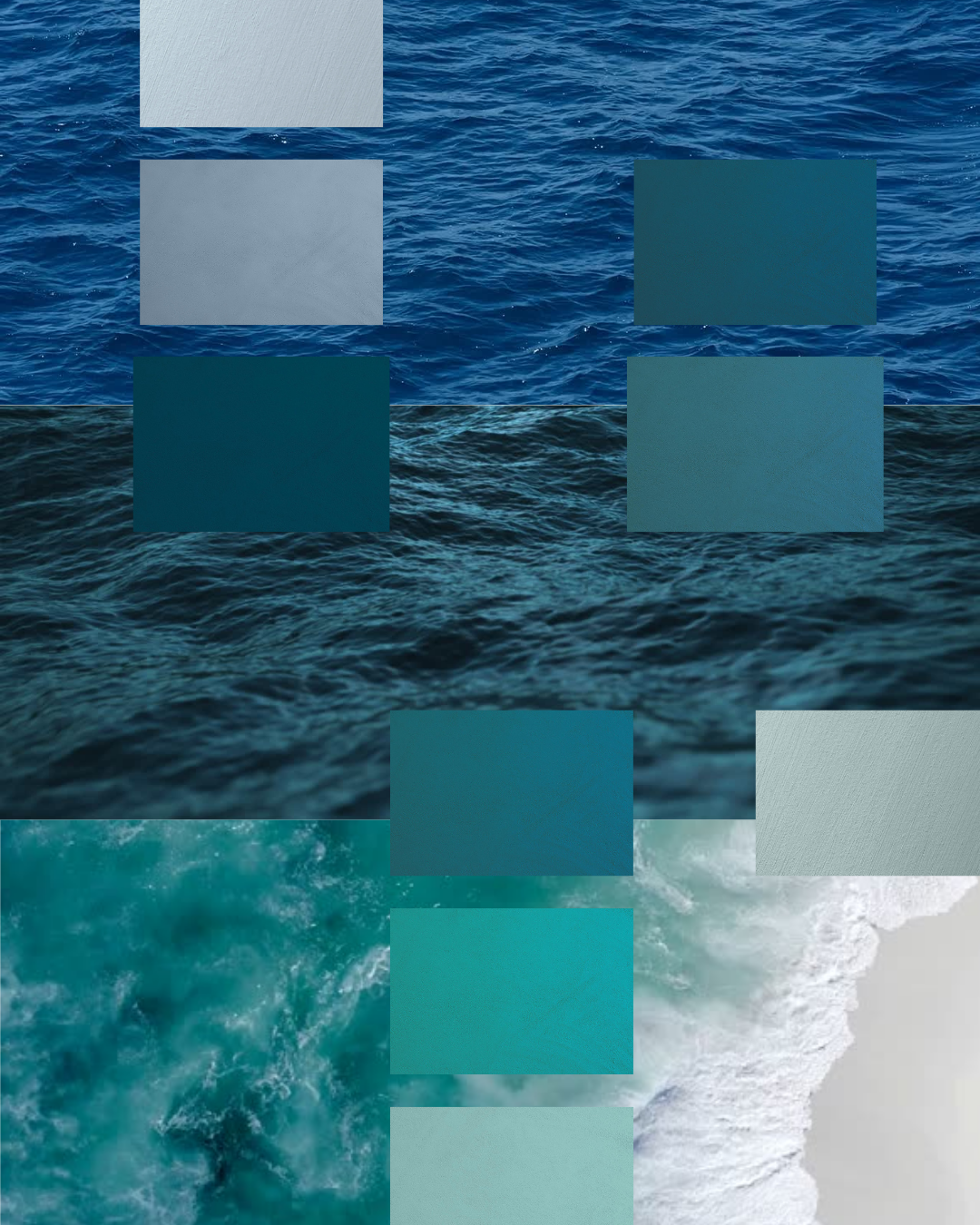
The blues of summer are never simply blue.
They move from misty mornings to cloudless skies. From pale sea spray to weathered harbour walls. From turquoise shallows to the deep indigo of evening.
Our palette captures these changing moments through mineral finishes that bring depth, softness and movement to every surface.
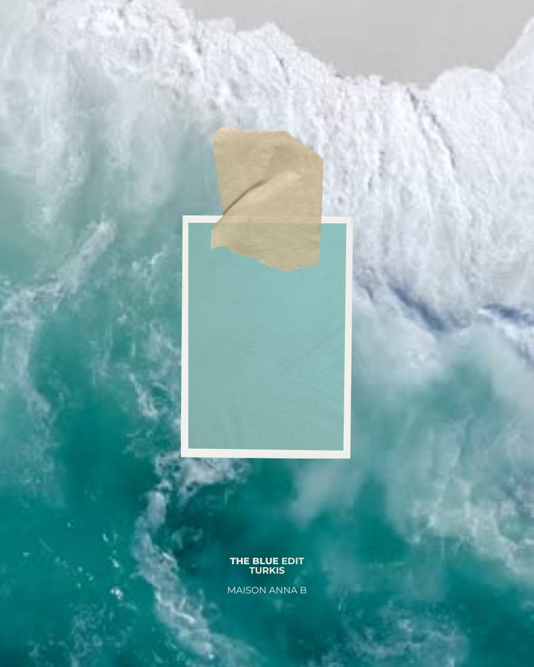
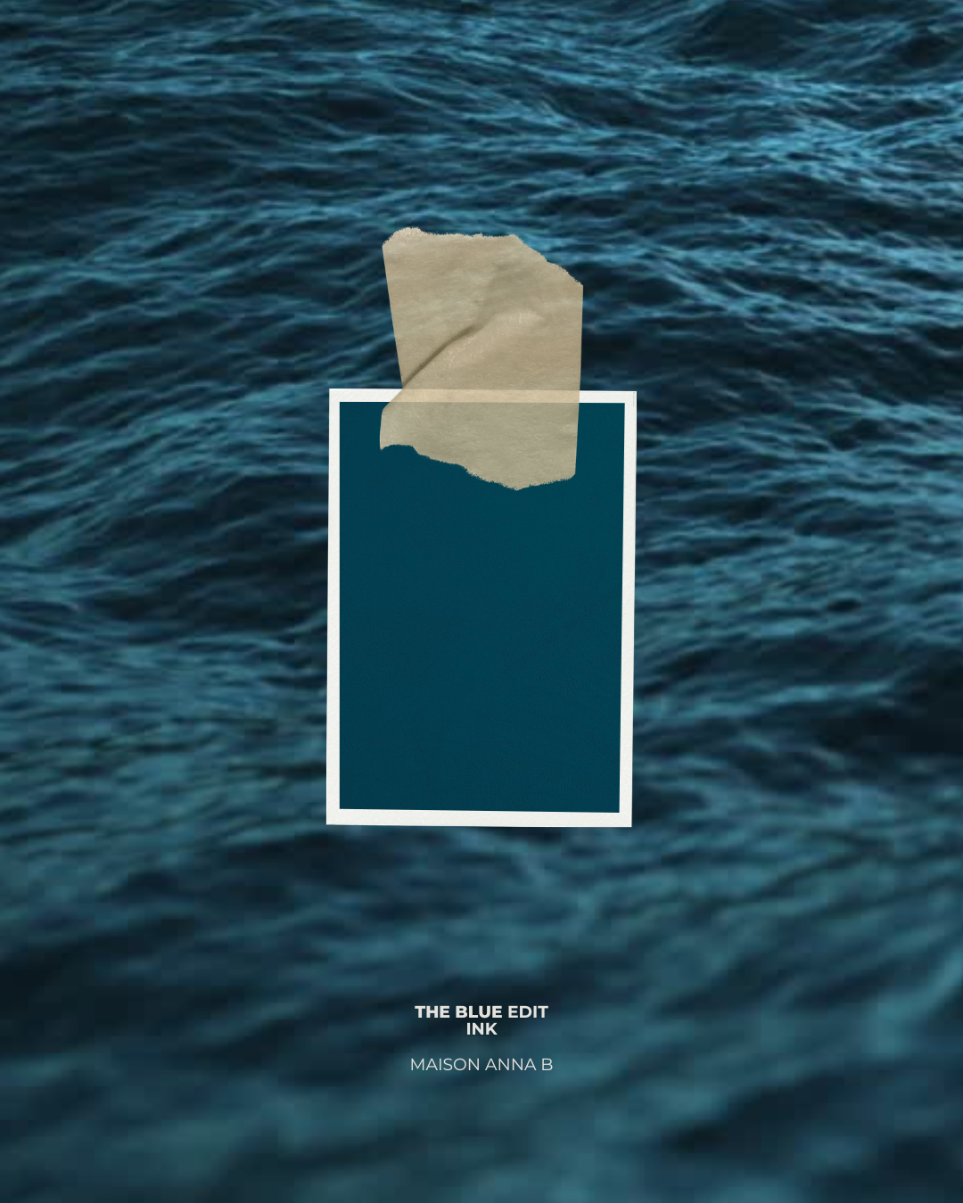
From the quiet elegance of RAKU and FUJI, to the airy freshness of CÉLESTE, the Mediterranean character of TREMPETTE, and the rich depth of INK, discover The Blue Edit and how each shade evokes a different mood while remaining unmistakably timeless.
Quiet. Airy. Effortless. The palest tones in the collection gently brighten a room while maintaining a calm, understated elegance.
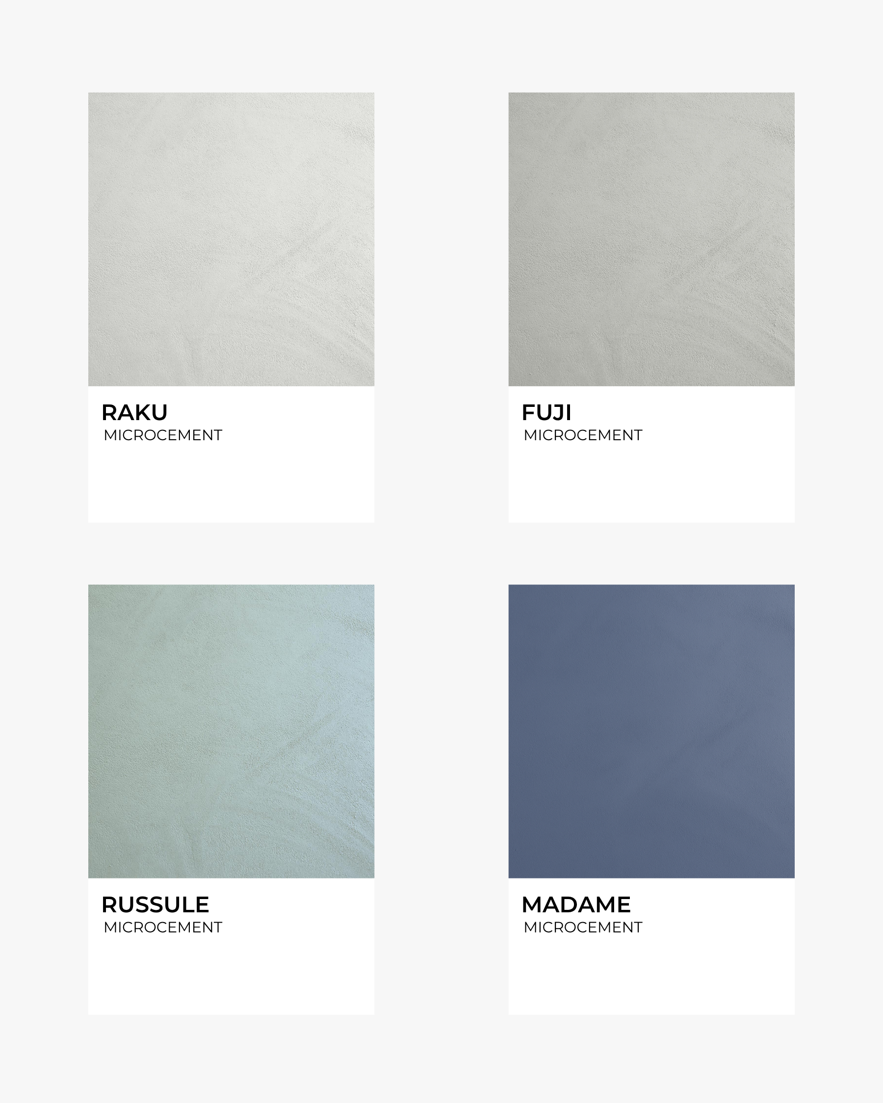
RAKU – A warm mineral white touched with the faintest blue-grey whisper.
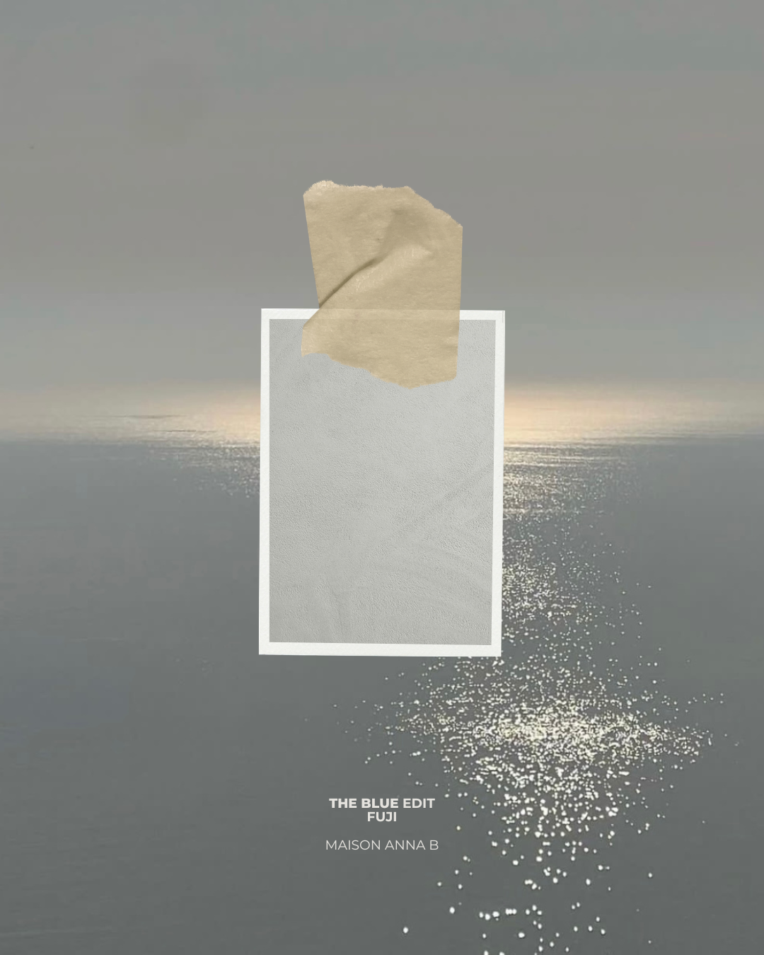
FUJI – A soft misty grey with cool mineral undertones.
LONGAGNE – An airy off-white that captures and reflects natural light beautifully.
Perfect for interiors where light takes centre stage.
Fresh. Relaxed. Light-filled. Inspired by early mornings by the sea and clear summer skies.
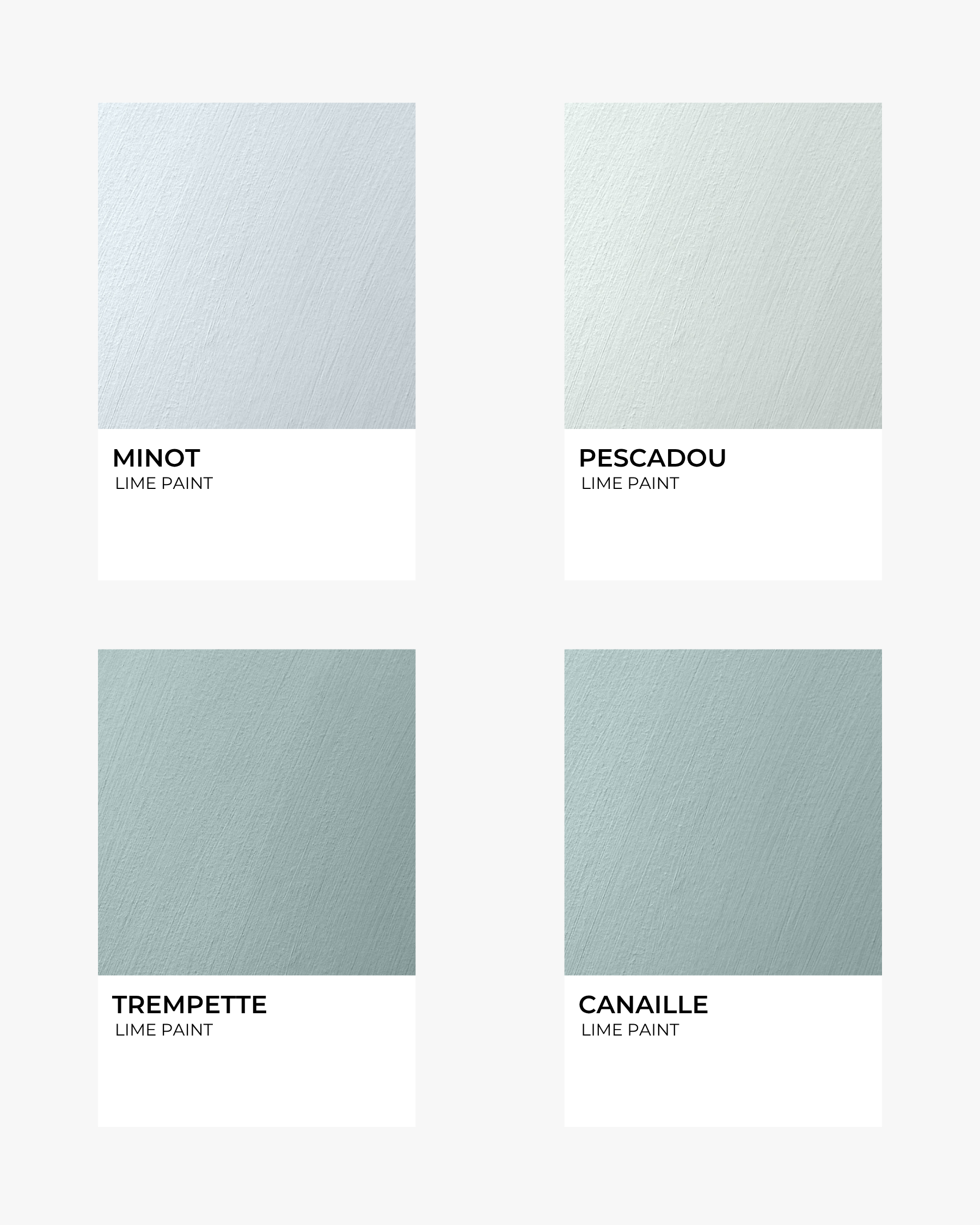
MINOT – A crisp pale blue with contemporary freshness.
PESCADOU – A delicate blue-green recalling calm coastal mornings.
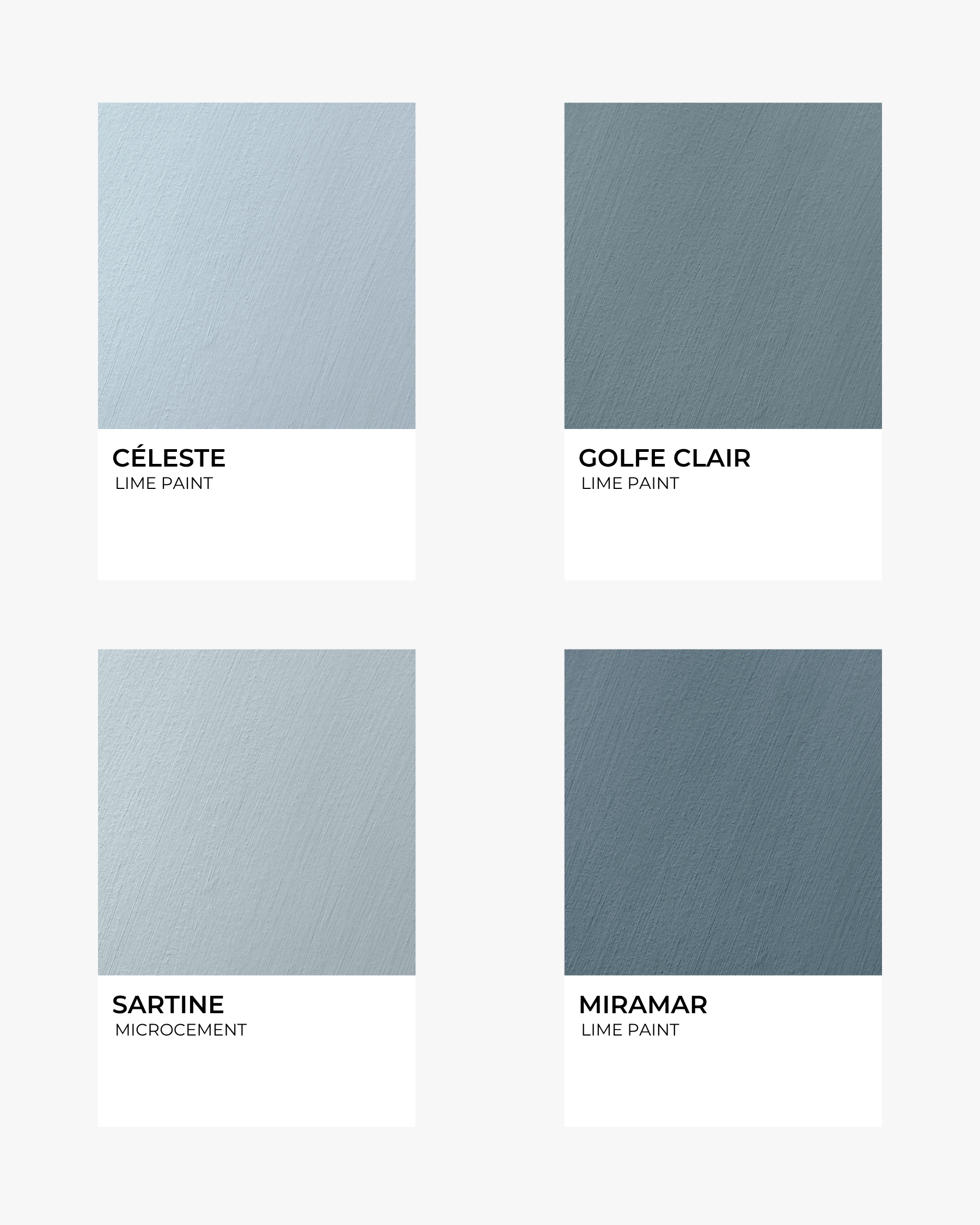
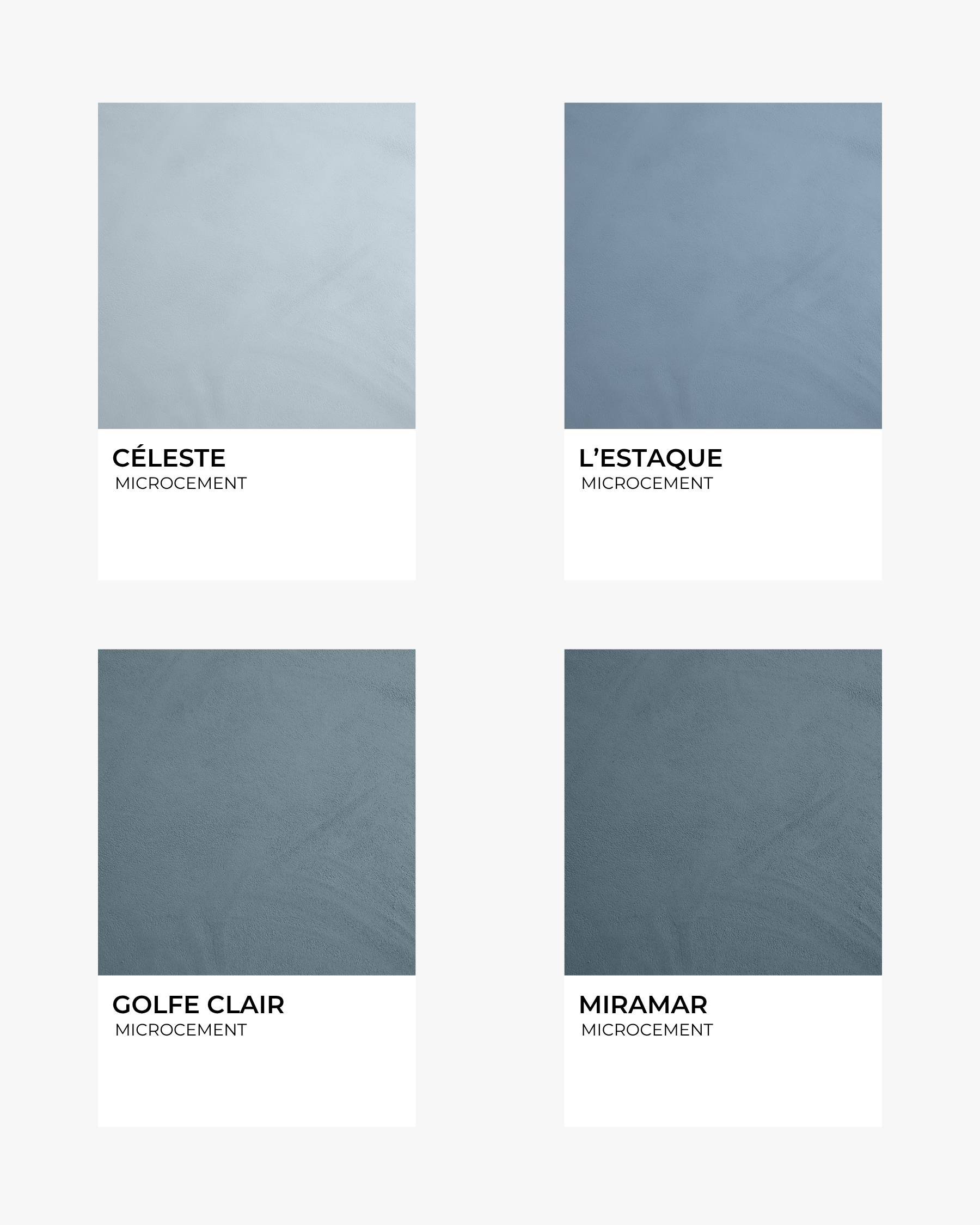
CÉLESTE – A luminous sky blue that instantly opens a room.
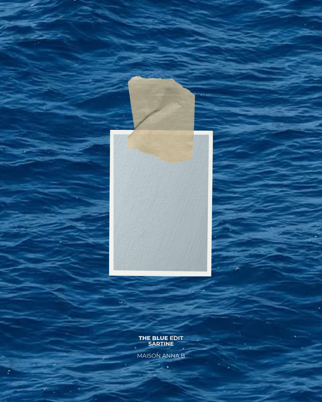
SARTINE – A pale mineral blue with seamless architectural elegance.
CANAILLE – A soft coastal blue-green with relaxed Mediterranean character.
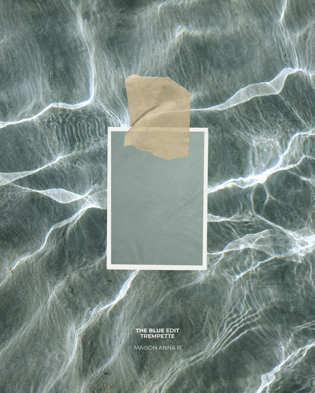
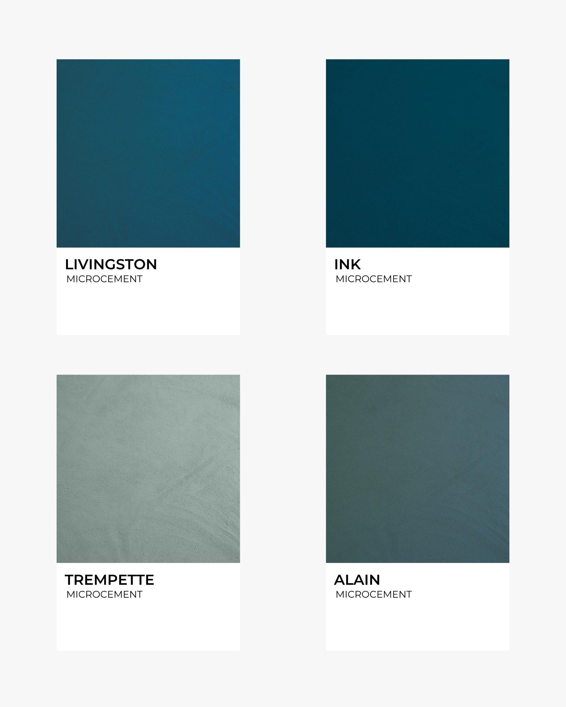
TREMPETTE – A muted aqua inspired by shallow, crystal-clear waters.
Beautiful in bedrooms, bathrooms and spaces designed to slow the pace of everyday life.
Balanced. Timeless. Sophisticated. Greyed blues that create depth without heaviness.
GOLFE CLAIR – A refined blue-grey with quiet presence.
MIRAMAR– A rich coastal blue that feels both classic and contemporary.
MADAME – A muted navy softened by mineral pigments.
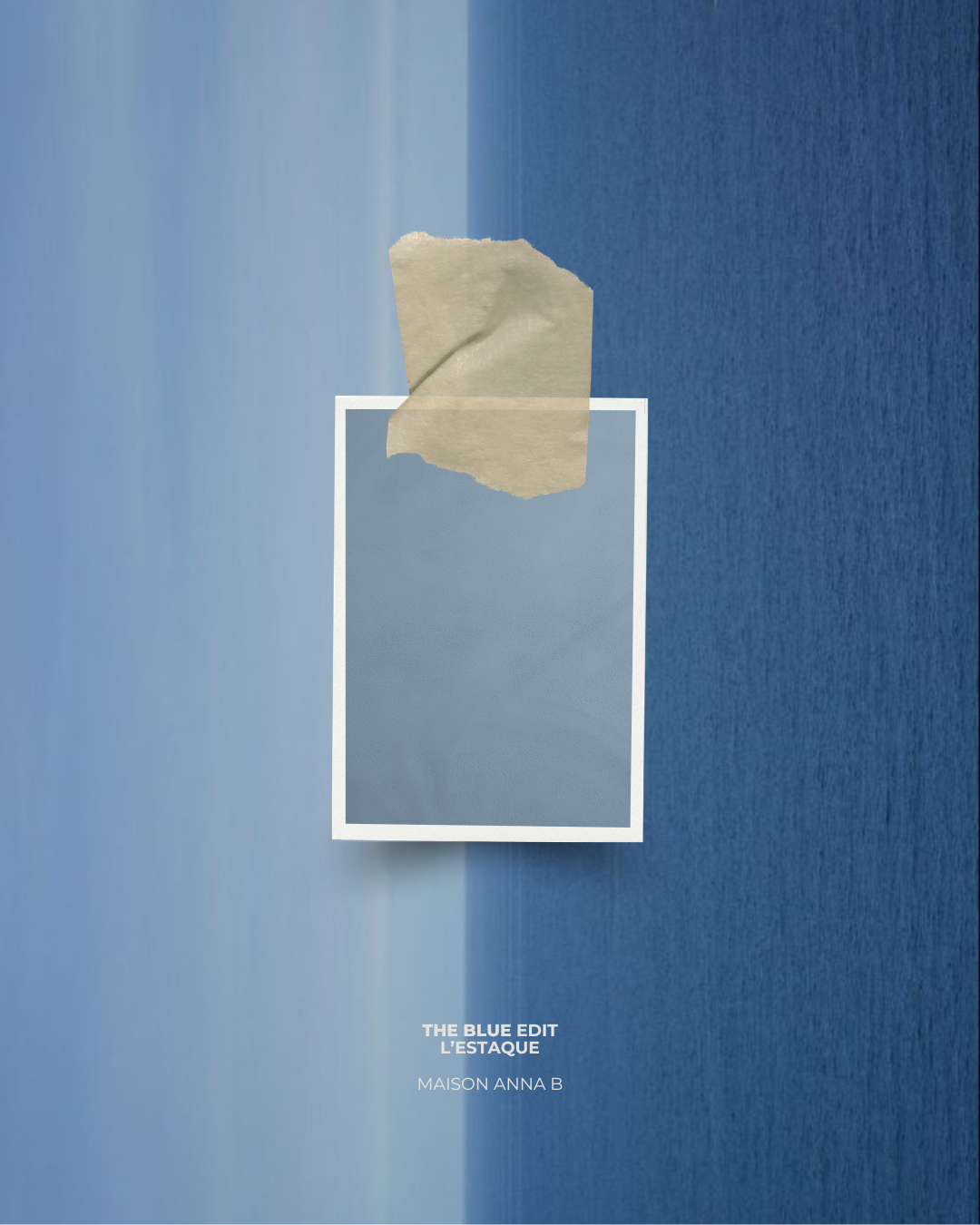
L'ESTAQUE– A smoky blue-grey inspired by Mediterranean stone and sea.
Ideal for creating elegant contrast while maintaining a calm palette.
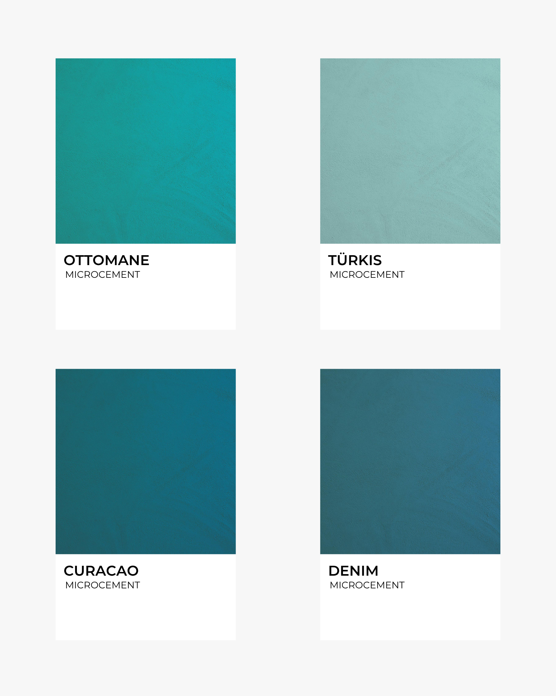
Sunlit. Vibrant. Joyful. Colours inspired by shimmering water, painted shutters and long summer days.
RUSSULE – A gentle turquoise softened by mineral warmth.
TÜRKIS – A luminous aqua filled with freshness.
OTTOMANE – A vibrant turquoise full of Mediterranean energy.
DENIM – A saturated blue that feels familiar yet contemporary.
CURACAO – A vivid tropical blue that brings instant personality.
For interiors that embrace colour while remaining refined.
Rich. Immersive. Dramatic. Confident shades that create beautifully cocooning interiors.
LIVINGSTONE – A dark petrol blue with remarkable depth.
INK – An intense blue-black that transforms a room with elegance.
ALAIN – A sophisticated blue-green that feels grounded and timeless.
Perfect for statement walls, powder rooms, kitchens or spaces where atmosphere comes first.
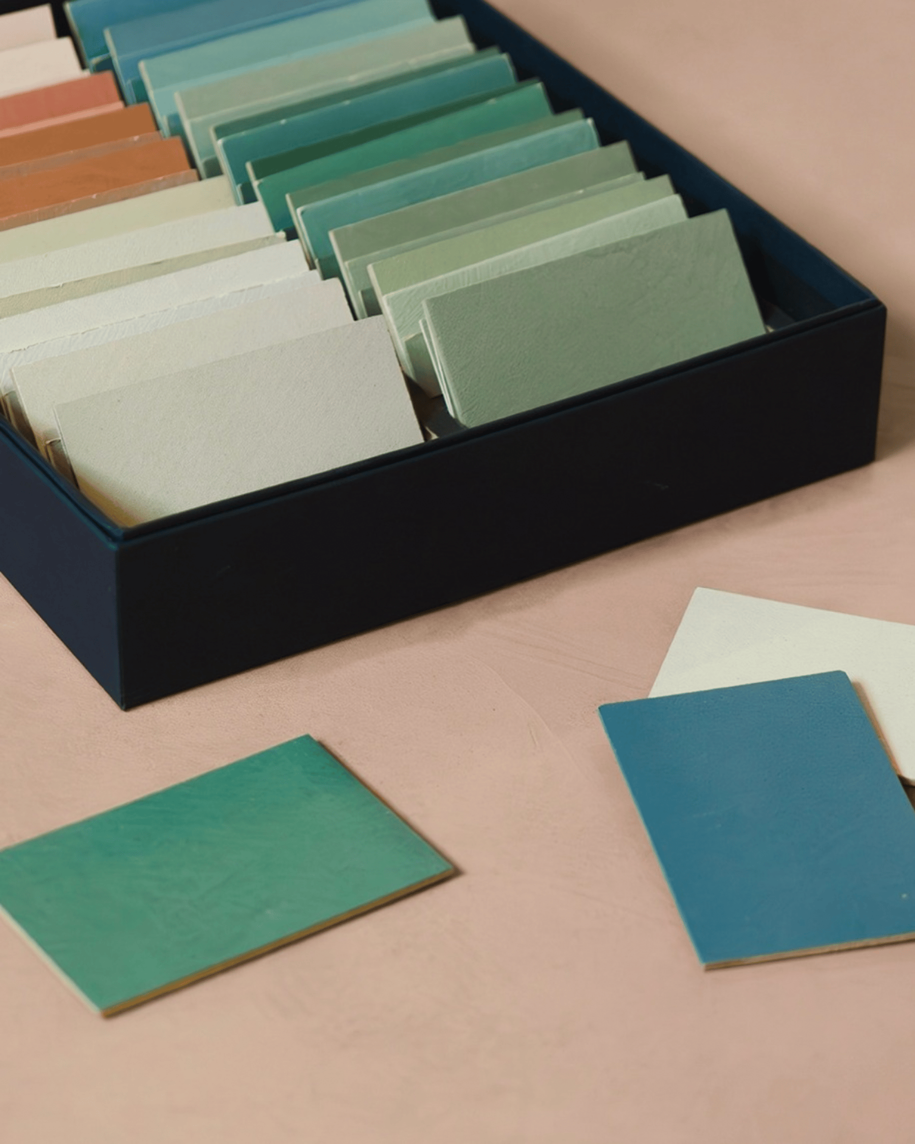
Our blue palette is available across lime paint and microcement, with selected shades exclusive to each finish. Every colour has been developed to express its full character through the texture and depth of mineral materials.
Whether you're refreshing a single room or designing an entire home, blue offers a palette that feels calm in summer, comforting in winter and timeless all year round.
Because the most beautiful interiors aren't remembered for their colour alone.
They're remembered for how they made you feel.
Are you ready to start your project ?
Blue has remained one of the most enduring colours in architecture and interior design for centuries.
Not because it follows trends, but because it changes how a space feels.
Soft blues gently recede, allowing rooms to breathe. Greyed blues introduce quiet sophistication without dominating their surroundings. Deeper tones create intimacy and depth, wrapping a room in a sense of calm rather than darkness.
Perhaps no other colour moves so effortlessly between serenity and confidence.
It feels equally at home in a light-filled coastal cottage, a contemporary townhouse or a minimalist city apartment.
Blue doesn't define a style. It defines an atmosphere.
The blues of summer are never simply blue.
They move from misty mornings to cloudless skies. From pale sea spray to weathered harbour walls. From turquoise shallows to the deep indigo of evening.
Our palette captures these changing moments through mineral finishes that bring depth, softness and movement to every surface.
From the quiet elegance of RAKU and FUJI, to the airy freshness of CÉLESTE, the Mediterranean character of TREMPETTE, and the rich depth of INK, discover The Blue Edit and how each shade evokes a different mood while remaining unmistakably timeless.
Quiet. Airy. Effortless. The palest tones in the collection gently brighten a room while maintaining a calm, understated elegance.
RAKU – A warm mineral white touched with the faintest blue-grey whisper.
FUJI – A soft misty grey with cool mineral undertones.
LONGAGNE – An airy off-white that captures and reflects natural light beautifully.
Perfect for interiors where light takes centre stage.
Fresh. Relaxed. Light-filled. Inspired by early mornings by the sea and clear summer skies.
MINOT – A crisp pale blue with contemporary freshness.
PESCADOU – A delicate blue-green recalling calm coastal mornings.
CÉLESTE – A luminous sky blue that instantly opens a room.
SARTINE – A pale mineral blue with seamless architectural elegance.
CANAILLE – A soft coastal blue-green with relaxed Mediterranean character.
TREMPETTE – A muted aqua inspired by shallow, crystal-clear waters.
Beautiful in bedrooms, bathrooms and spaces designed to slow the pace of everyday life.
Balanced. Timeless. Sophisticated. Greyed blues that create depth without heaviness.
GOLFE CLAIR – A refined blue-grey with quiet presence.
MIRAMAR– A rich coastal blue that feels both classic and contemporary.
MADAME – A muted navy softened by mineral pigments.
L'ESTAQUE– A smoky blue-grey inspired by Mediterranean stone and sea.
Ideal for creating elegant contrast while maintaining a calm palette.
Sunlit. Vibrant. Joyful. Colours inspired by shimmering water, painted shutters and long summer days.
RUSSULE – A gentle turquoise softened by mineral warmth.
TÜRKIS – A luminous aqua filled with freshness.
OTTOMANE – A vibrant turquoise full of Mediterranean energy.
DENIM – A saturated blue that feels familiar yet contemporary.
CURACAO – A vivid tropical blue that brings instant personality.
For interiors that embrace colour while remaining refined.
Rich. Immersive. Dramatic. Confident shades that create beautifully cocooning interiors.
LIVINGSTONE – A dark petrol blue with remarkable depth.
INK – An intense blue-black that transforms a room with elegance.
ALAIN – A sophisticated blue-green that feels grounded and timeless.
Perfect for statement walls, powder rooms, kitchens or spaces where atmosphere comes first.
Our blue palette is available across lime paint and microcement, with selected shades exclusive to each finish. Every colour has been developed to express its full character through the texture and depth of mineral materials.
Whether you're refreshing a single room or designing an entire home, blue offers a palette that feels calm in summer, comforting in winter and timeless all year round.
Because the most beautiful interiors aren't remembered for their colour alone.
They're remembered for how they made you feel.
Are you ready to start your project ?